How to Create a Sitemap: 6 Steps for a More Thoughtful Website
What makes a website worth visiting? Thoughtful design.
Just like thoughtful friends, thoughtful design makes you feel special. The best websites make you feel like someone spent time thinking about your browsing experience. Whether you're a marketer, designer, or developer, everyone should want to make more thoughtful websites.
So how do you do it?
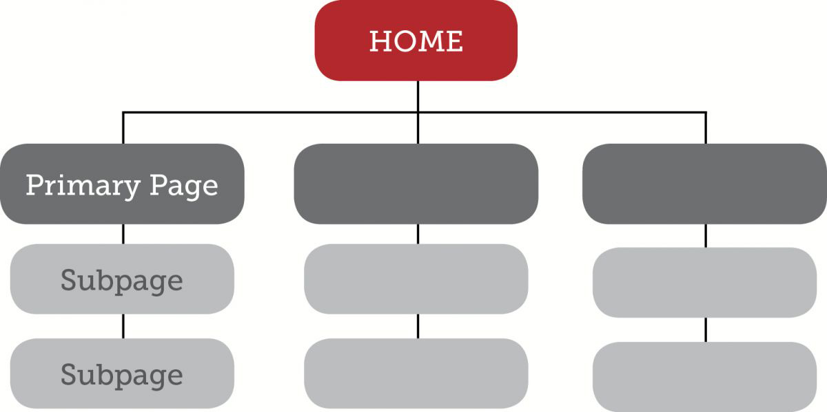
The first step is learning how to create a sitemap — a diagram of the key pages in your site, organized in a hierarchy:

Looks pretty simple, right? But there's more to creating a sitemap than listing out the pages in your website. In this post we'll walk through 6 steps for creating a sitemap that matters to your users. Follow this guide and you won't just make a better sitemap — you'll set the tone for building a truly thoughtful website.
Only the names have changed...
Throughout this guide, we'll draw our examples from a fictional music school, Coltrane University. Here's a little background info for our exercise:
Coltrane University is a graduate-level music school with an in-person campus and online courses. Their campus programs offer full-time performance degrees, and campus life focuses on in-person workshops, jam sessions, and concerts. Their online programs offer certifications, and all online programs are offered through a third-party software portal.
Don't worry if your company looks a little different. The sitemap process is pretty much the same, regardless of industry or company size.
1. Define Your Users
Above all else, your website should provide relevant information to your users. So, when planning your sitemap, define your users based on the information they want to find. You can do this with two simple exercises:
Who are your users?
For Coltrane University, we have three groups of people who use the website:
- Prospective Students
- Current Students
- Faculty & Staff
- Search Engines (most people forget this group)
What are they looking for?
To flesh out your user groups, add a few descriptive sentences for each:
- Prospective Students are looking for more information about degree programs. They may want to request information or apply online.
- Current Students are looking for program-related resources. Campus students are looking for events and other on-campus resources. Online students will want to log in to their user portal.
- Faculty and staff are looking for program-related resources and campus events.
- Search Engines are looking for well structured content/data
2. Identify Your Focus Pages
Now that you have user group descriptions, review what you've written. Identify which user needs might require a specific page. These will be focus pages — pages based on specific user needs.
Here's our Coltrane University example, with the page needs in italics:
- Prospective Students are looking for more information about degree programs. They may want to request information or apply online
- Current Students are looking for program-related resources.
- Campus students are looking for events and other on-campus resources.
- Online students will want to log in to their user portal
- Faculty and staff are looking for program-related resources and campus events
- Search Engines are looking to understand your content's relevance when someone searches the general service your institution offers
By doing this exercise, we’ve discovered 6 focus pages for the new Coltrane University Site:


3. Choose Your Basic Pages
Now that you’ve got your focus pages, you’ll want to add other pages not captured by your user exercise. These are basic pages — common informational pages shared by many websites. Here’s a list of common basic pages:
| Page | Description | Relevant? |
|---|---|---|
| Home | Serve your most relevant content | x |
| About | Describe your mission, culture & history | x |
| People | List the key people within your company | x |
| Process | Show how you do it differently | |
| Portfolio | Show your work here | |
| Products | List and describe your products | |
| Programs | List and describe you programs | x |
| News | Post timely, relevant news & press releases | x |
| Events | Post events | x |
| Blog | Post relevant insights | |
| Contact | Collect user information and show locations | x |
For our example, we’ve checked the pages that would be relevant to the Coltrane University website. Notice that many of these pages have already been covered by the initial user exercise, which tells us we’re on the right track. But we have also identified some important new pages for our sitemap: Home, People, News, Contact
At this point, consider if the basic page titles are a good fit for your navigation. With Coltrane University, People could be called Faculty and Contact could be called Campus. This gives us 4 new basic pages for our site:

4. Organize Your Navigation
Once you have your working list of pages, it’s time to organize your site navigation. Many sites contain two important navigation menus, Primary Navigation & Utility Navigation:

Primary Navigation is the basic content hierarchy for your website. It contains “buckets” for all of the important content. It should be clean, with no more than 7 or 8 links. Otherwise, it starts to look cluttered.
Utility Navigation is an additional menu, smaller than the Primary Navigation. It contains pages which are not part of the main content structure, but serve an essential function for users. For example, an “Apply Now” link is not content-rich, but it’s an important link for users. Some other common utility links are Shopping Cart, Login/Logout, Site Search, Contact.
Note that "Home" is not in the Primary or Utility Navigation. We typically link the logo to the Homepage to help keep a clean Primary Navigation.
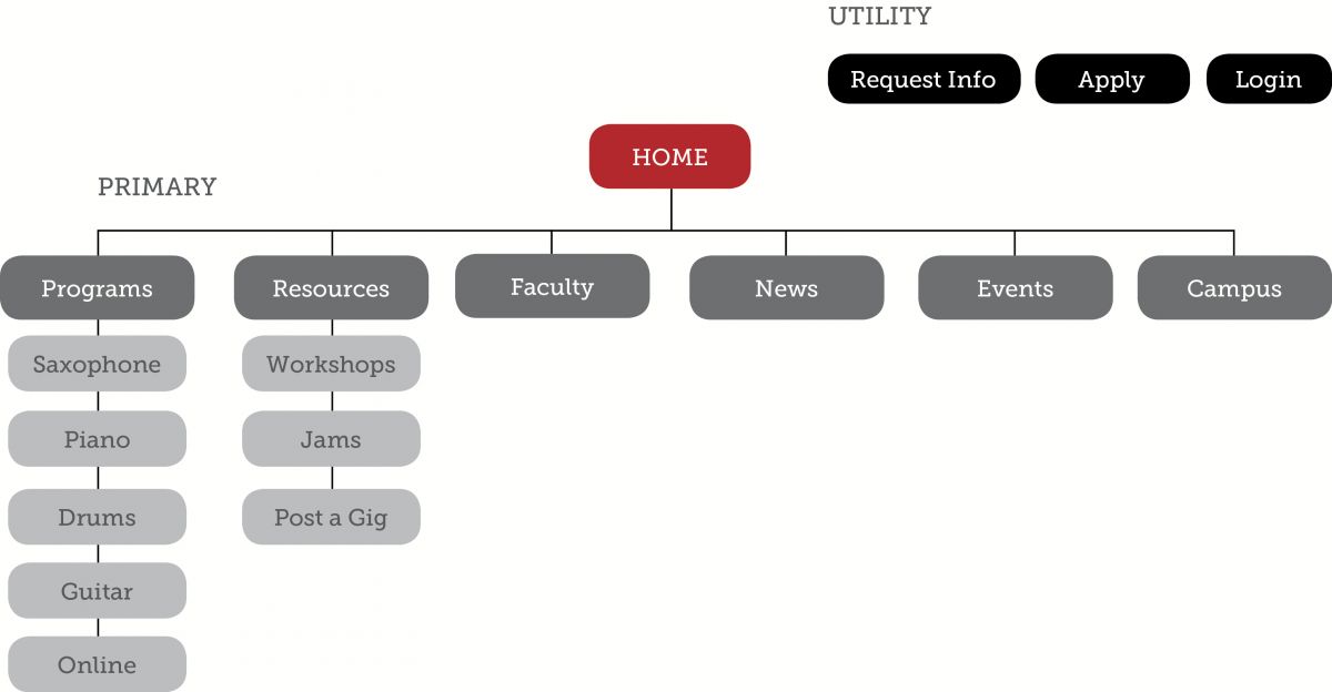
Using our Coltrane University example, we have created 9 links, and we need to organize them into a Primary and Utility Navigation. Based on the principles described above, here's how our navigation breaks down:

---
5. Add Subpages
Subpages are second-level pages in the Primary Navigation. If one of your Primary pages easily breaks down into further “content buckets,” try laying out a Subpage structure for that page.
For Coltrane University, we know that there are different degree programs and different types of resources. So, we need a Subpage structure for Programs and Resources:

6. Create a Visual Layout
Now you have everything you need to make the first draft of your sitemap. Since you’ll be sharing this sitemap with other people in your company, you'll want to create a visual layout. Don't worry if you're not a designer — you can use a free sitemap tool like Slickplan to turn your list of pages into a snazzy visual sitemap (excel can also do the trick).
For Coltrane University, our visual layout shows both Primary and Utility Navigation:

The Revision Process
Once you've made a visual layout, you have a draft to share it with your team. Most sitemap drafts go through 2-3 rounds of revisions, so you can expect to make tweaks, additions, and subtractions based on discussion and feedback.
Here are some common questions that come up during the sitemap revision process:
Should we add more pages?
As a general rule, you want the minimum number of necessary pages. Developing good content for each page takes time and effort — you want to make sure that you really have something to say with each page. Users don't want to comb through dozens of subpages to find what they need. In most cases, less is more. If you really have an appetite for extensive content, consider adding a blog and maintaining a publishing schedule post-launch.
Will we use dropdown menus?
This is an important question, but it's not something you need to decide when planning our initial sitemap. There are many options for showing your subpage navigation, including dropdown menus.
For example, you might have sidebar navigation on your subpages:

Or you may use breadcrumb navigation to help users navigate through subpages:

All of these approaches are equally valid. A good sitemap will help your design team understand the content vision for the site. You can leave the finer details up to them, and refine the approach as part of your design revisions.
Where do our social media links go?
Social media links usually go in the footer navigation, for reference. You draw in visitors by participating in social media conversation, but once they arrive, the goal is to keep them on your site. Like every good rule, there are plenty of exception to this. For example, on your blog, you may want to encourage users to connect with you on social media and share content directly from your site:

What about the footer?
For the first draft of your sitemap, forego designing the footer. Once you have a final draft of your primary navigation and subpages, consider what should be included in the footer. You might take a comprehensive approach, showing all links and submenus in your footer. Or, you might take a minimalist approach, only including your copyright info, privacy policy, and any other disclosures. You can lean on your design team to provide direction here.
---
Learning how to create a sitemap will help you understand your users and clarify your site objectives. As you work on your sitemap revisions, don't be afraid to explore why your website exists and what you want it to do for your visitors.
Want to learn how to make a better website? Your sitemap is only the first step. We help people design more thoughtful web experiences, and we start from the ground up. If this guide helped you understand your sitemap, maybe you'd like to learn more about our process. Or, if you have an upcoming design project you want to discuss, feel free to drop us a line or leave us a comment — we'd love to hear from you.