The 14 Best Non-Profit Donate Page Examples
Nonprofit donation pages are a critical part of any nonprofit's fundraising strategy. They are the online gateway for donors to give their support to a cause they care about.
We also recognize there are a lot more features to consider in a donation software selection process. Our focus here is solely on the visual aesthetic that shapes the donor experiences on your website's frontend.
A well-designed donation page can make a big difference in the number of donations a nonprofit receives.
While we don't possess data for every experience, redesigning your donation experience can improve donations from 20% to over 200%. It's good to question whether the lackluster and subpar nature of your online donation experiences might be the very thing that hinders their potential.
Could optimizing the user experience lead to more frequent and generous contributions? It's a compelling consideration, especially when you factor in the constraints of:
- Your users' time
- The concept of decision fatigue
Here are the software providers we looked at:
- ActBlue
- Blackbaud
- Braintree by Paypal
- Classy
- Click & Pledge
- Committed Giving
- Everyaction
- Fundraise Up
- Funraise
- GiveForms
- GiveLively
- Network for Good
- Paypal
- Stripe
There were a few different ways the donation software could be implemented:
- Embedded on the NFP's website and custom styled to match the site
- Loaded in the donation providers platform and styled to match the NFP
- Served as a lightbox pop up
Each of these executions could be done very well. It often came down to how approachable the form felt.
Usually, the following items were common on the better-looking forms:
- Free of any top navigation
- A single heartfelt image
- A punchy title
- A succinct message that speaks volumes
- A multi-step form with a single straightforward decision donors have to make – "How much and how often would I like to give?"
ActBlue Donation Page Examples
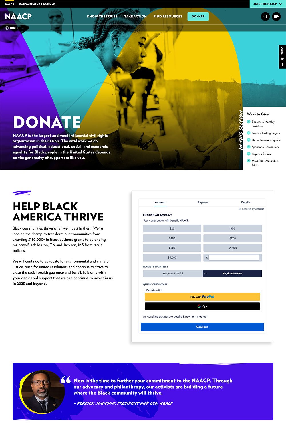
The NAACP's ActBlue Donation Experience
The NAACP embedded its donation form onto a very robust donation page. It was so robust we couldn't share the whole image here. While this was not the norm. It was undeniably a very nice-looking page — just no way to tell how effective a page like that is.
Other Non-Profits Using ActBlue:
- Alliance for Retired Americans
- Black Lives Matter
- Showing Up for Racial Justice
Blackbaud's Best Donation Page
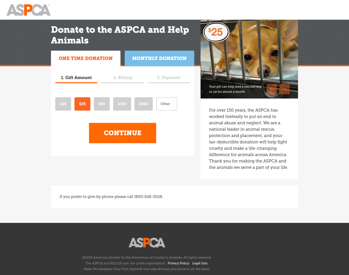
ASPCA Using Blackbaud for Online Donations
One of the best executions of Blackbaud for online donations was the ASPCA which had a very minimalistic form that felt highly doable because it exposed zero fields. All you had to do was look at a sad puppy and click contribute.
Other Non-Profits Using Blackbaud
- Chicago Public Library
- Children's Rights
- Mayo Clinic
Braintree's Donation Page Examples
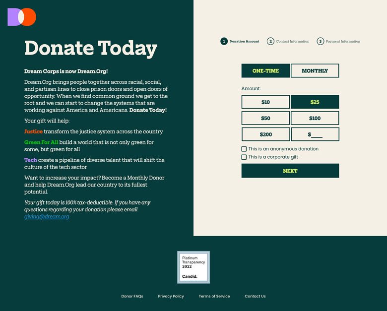
Dream.org's Braintree Donation Experience
Dream.org followed a similar path as ASPCA and opted for progressive disclosure. Meaning that they gradually provide more fields at each click so as not to overload the donor.
Other Non-Profits Using Braintree
- Comic Relief
- Save the Children
- St Jude Hospital
Classy's Donation Page Examples
Classy could be configured as a simple popup effect or re-direct to a unique donation page.
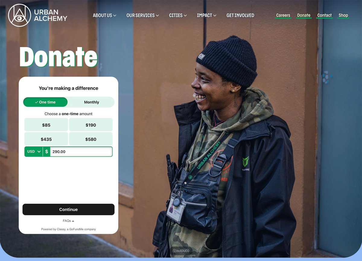
Urban Alchemy's Classy Donation Experience
Urban Alchemy is a groundbreaking organization addressing homelessness. Urban Alchemy embraced the undeniably simple approach of offering a single decision to make at a time and the multi-step form. Below that you can read more about the work that they do, but if someone clicks donate or give the best thing you can do is serve up what they asked for.
Other Non-Profits Using Classy:
- Salvation Army Christopher & Dana Reeve Foundation
- (RED)
- Shriner's Hospital
Click & Pledge's Donate Page
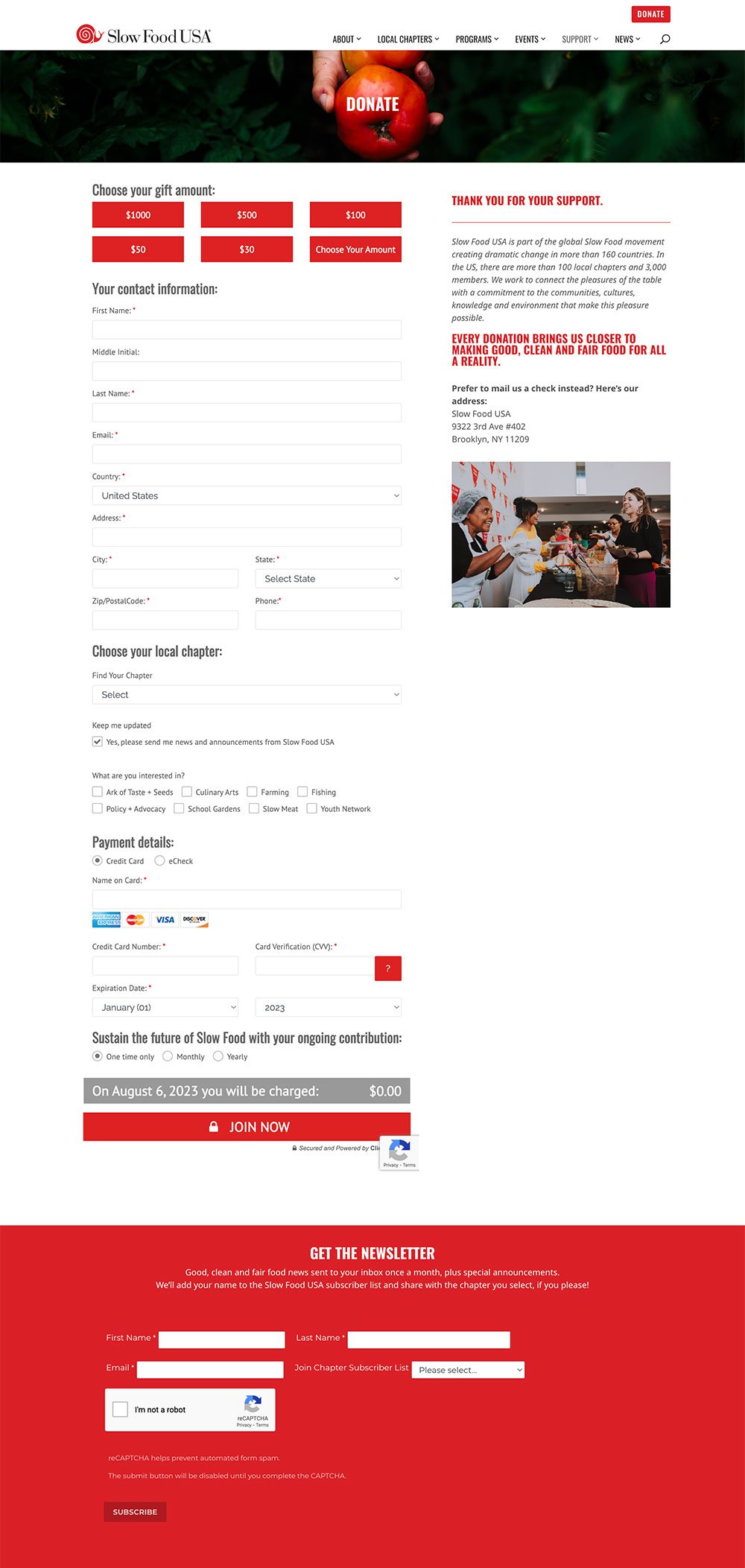
SlowFood USA's Click & Pledge Donate Page
Click & Pledge had one of the more intimidating donate layouts. This was universal for all Non-Profits using Click and Pledge exposed the roughly 22 possible points of decision-making all in one single view.
When we spoke to someone at Click & Pledge, we found out that they will be rolling out a multi-step option soon.
Other Non-Profits Using Click & Pledge
- Housing Forward
- Housing Works
- Transgender Law Center
Committed Giving Donate Page
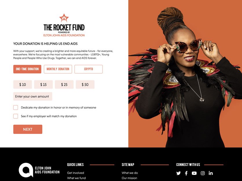
Elton John Foundation's Committed Giving Donate Page
Of these cream of the crop pages, this was one that stood out partially because it has a legendary rockstar tied to it, but also because it was so well done. Simple title and message and a very limited number of decisions to make out of the gate.
Committed Giving's Contact Options
- Phone: UK
- Chat: None
- Webform: Active
Everyaction Donation Page Example
Everyaction is a product of Bonterra.
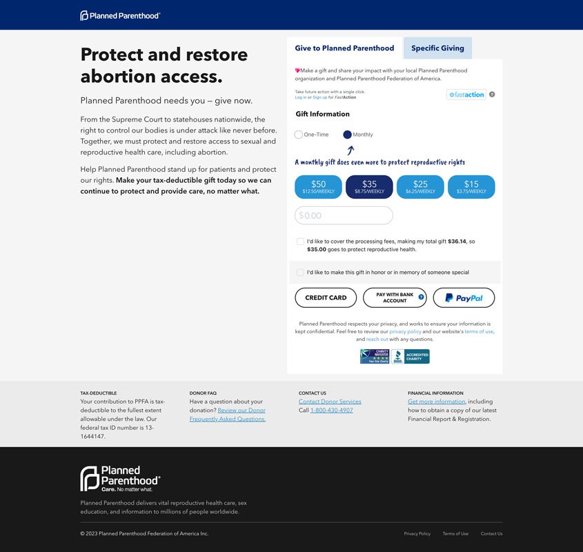
Planned Parenthood's Everyaction Donation Experience
Planned Parenthood had a very simple message and donation flow that, like a lot of the more approachable forms, limited the number of fields a user is introduced to once they land on the page.
Other Not-For-Profits Using Everyaction
- Anita B
- Feeding America
- Vera Institute
Fundraise Up Donation Page Examples
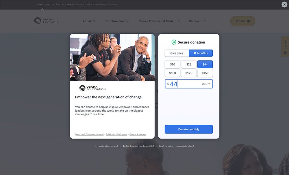
Obama Foundation's Fundraise Up Donate Experience
Leave it to the Obama Foundation to take something that doesn't seem like it can be improved on and make it simple. Feels like this form might fill itself out.
Other Non-Profits Using Fundraise Up:
- Boys and Girls Club
- Charlize Theron Africa Outreach Project
- UNICEF
Funraise Donation Page Examples
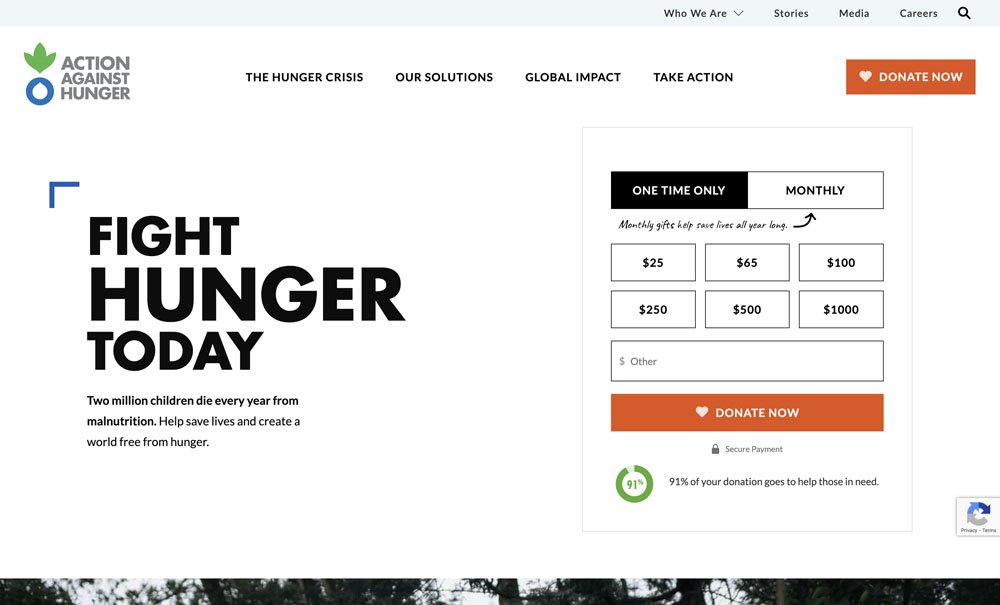
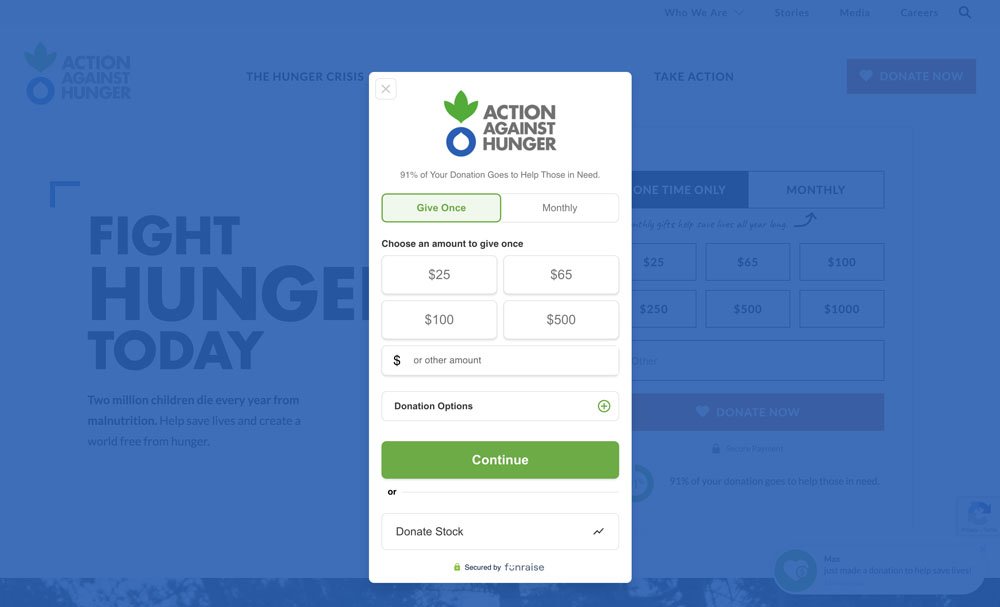
Action Against Hunger's Funraise Donation Experience
Action Against Hunger appears to have implemented two different layout options:
- Embedded on their home page
- A popup overlay experience.
Both looked equally tempting. Even if you didn't come with the intention to donate the experience gives visitors the sensation that this is something you could easily accomplish.
Other Non-Profits Using Funraise
- Invisible Children
- Robert F. Kennedy Human Rights
- Water for Good
GiveForms Donate Page Example
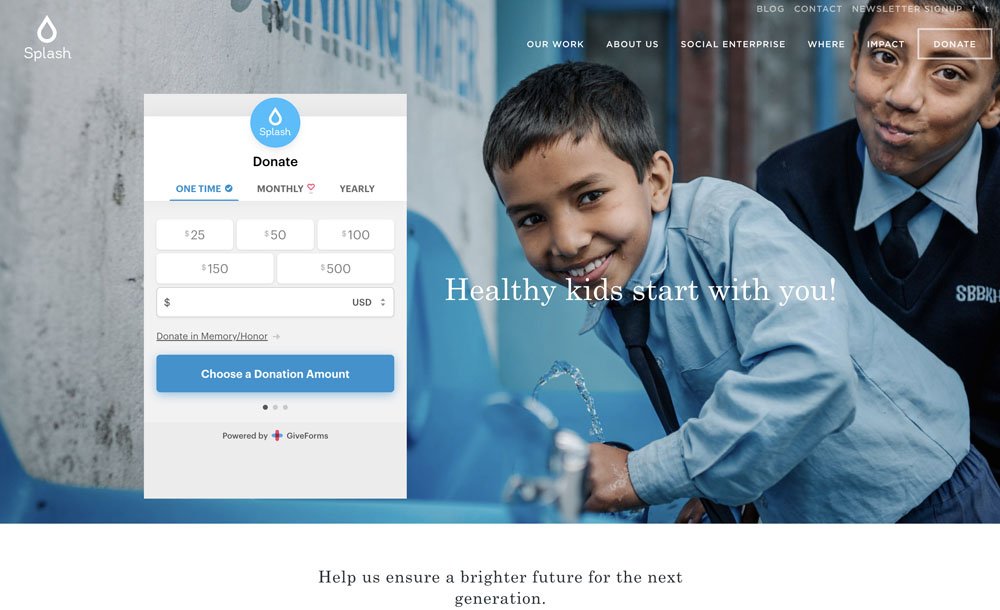
Splash's Give Forms Donate Page
Followed a formula that a lot of the other great donation layouts followed. Don't make users think about how much work this form is going to be. Put figurative blinders on your donate form and just let donors focus on one thing at a time.
Other Non-Profits Using GiveForms
- Bright Focus Foundation
- Rotary
- Wholesome Wave Georgia
GiveLively Donation Page Examples
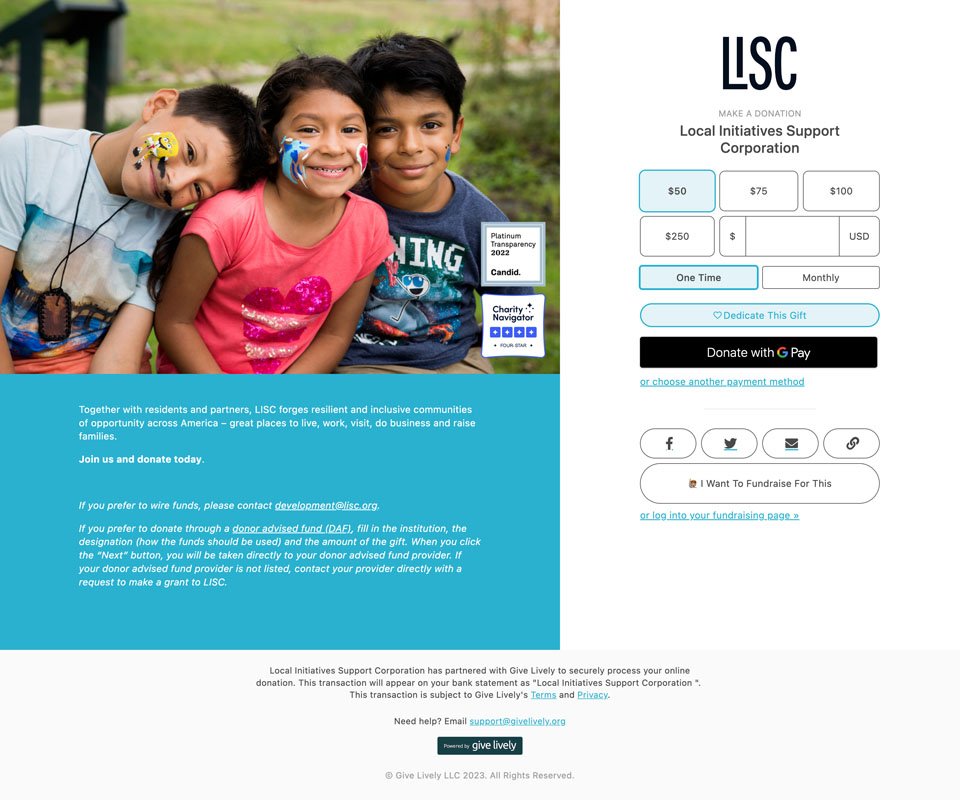
LISC's GiveLively Donation Experience
LISC does some amazing transformative work and we have been fortunate enough to get to work with them. Their page was simply laid out. The only area that could be improved is maybe adopting more of the content format from Elton John's Foundation or Planned Parenthood donation pages and have a clearer impact title with a succinct 3-4 sentence message.
Other Not-For Profits Using GiveLively
- Amazon Conservation
- Hidden Genious Project
- Malala Fund
Network for Good's Donate Page
This is also a Bonterra donation software.
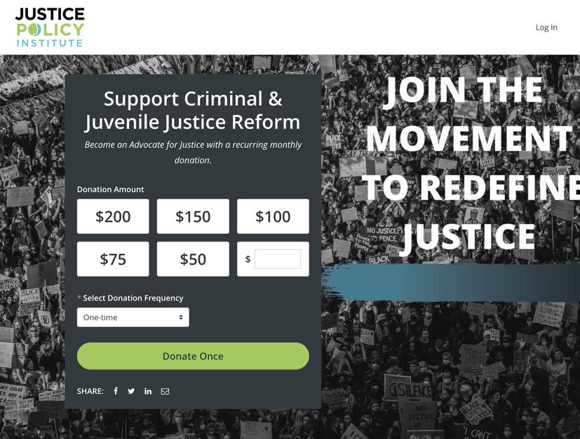
Justice Policy Institute's Network for Good Donate Page
They had an equally approachable donate page similar to ASPCA because it progressively disclosed a limited number of options and fields in a simple multi-step donation form.
Other Non-Profits Using Network for Good
- Achieve Tahoe
- CreatiVets
- Rise for Youth
Paypal Donation Page Example
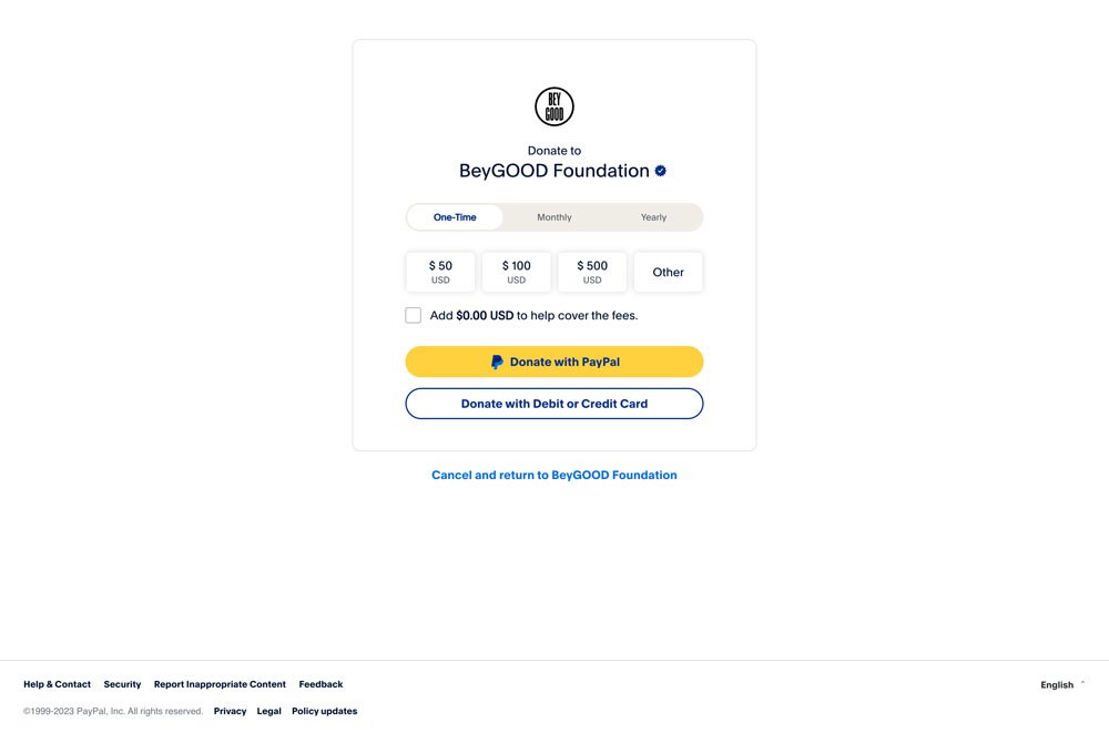
BeyGOOD Foundation's Paypal Donate Page
This is probably the most humble approach to accepting donations, but also still very effective and follows the same formula as the other leaders... Multi-step and a very focused decision to make at first "How much and how often do I want to give?"
Other Non-Profits Using Paypal
- American Association for Access, Equity, Diversity
- Indigenous Roots
- National Center for Women in Tech
Stripe Donation Page Example
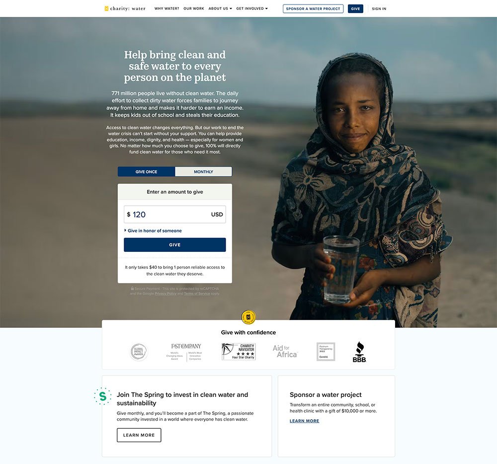
Charity:Water's Stripe Donation Experience
Charity Water had one of the best websites and donation experiences. They also are pioneering some really interesting ways to empower their supporters to invent their own campaigns, and even have some pre-designed assets for content creators and streamers to plug Charity Water ads into their streaming content.
Their website and donation experiences are on point.
Other Non-Profits Using Stripe
- FaithActs
- GLAAD
- Doctors without Borders
Not Easy, But It's Also Not a Mystery
Some of these examples are a testament to the power of:
- Visual aesthetics
- Seamless user experiences
- Innovative design elements
And how to foster a deeper connection between donors and the causes they support.
But What Should You Do?
If there is still any confusion, follow these guidelines.
- When possible, eliminate distractions like navigation from the header and/or scary terms or fine print from your footer
- Use an image that tugs on your donors heartstrings
- Write a compelling title also tugs on those same strings
- Keep your message succinct and compelling (no more than 2-4 lines)
- If your software allows it use a multi-step form with limited tasks at each step
Forms will keep evolving and getting better, but these are some great practices you can adopt today.