How to Design the Perfect Nonprofit Website Homepage | 8 Must Haves
A nonprofit's homepage is the organization’s digital front door, making it one of the most critical tools for connection and engagement.
It’s often the first impression visitors have, offering a chance to clearly communicate your mission, showcase your impact, and build trust. A strong homepage inspires action—whether it’s donating, volunteering, or learning more—and provides an emotional connection through compelling visuals, stories, and clear calls-to-action.
It’s also a gateway for those seeking help, offering easy access to resources and information. Ultimately, the homepage sets the tone for your nonprofit’s entire online presence, transforming casual visitors into committed supporters.
So it stands to reason that it's important to think about our users and what questions they are coming to this page with:
- What is their vision for the future?
- What impact has this nonprofit achieved so far?
- How is my donation being used?
- What makes this nonprofit unique?
- Who else supports/partners with this nonprofit?
- What urgent needs can I address right now?
- How easy is it to get involved beyond donating?
- What is the scale of the problem they’re tackling?
- Do they provide updates on the impact of donations?
- Are they financially responsible and transparent?
- Can I trust this organization with my donation?
- Do they have a proven track record?
Understanding these questions helps create a homepage that informs, engages, and inspires action.
An outline to plan your Non-Porift's homepage
Designing an effective nonprofit homepage is about creating a seamless experience for your visitors. Your homepage should not only look great but also walk visitors through the key aspects of your organization, helping them understand who you are, what you do, and how they can get involved.
To address these needs effectively, we researched 163 non-profit websites and identified a basic structure that works well for nonprofit homepages:
- Hero Message + Image: Why does this matter?
- Mission: Where are you going?
- Programs: How are you making a difference?
- Impact: What have you accomplished?
- Take Action: How can people get help or give?
- Social Proof: What are others saying?
- Promote: How are you leading?
- Area(s): Where do you serve?
Hero Message + Image
Your homepage’s hero section—the featured image and headline—is your nonprofit’s first chance to make a powerful impression. This space is more than just decorative; it’s where you clearly and instantly convey your mission, frame the problem you’re addressing, and draw visitors into your story. Think of it as your digital handshake—it sets the tone for everything else.
Don’t assume your audience is already on board. This is your opportunity to educate skeptics, inform casual visitors, and even surprise your most loyal supporters with something new.
About the Hero Message
Our research shows that 70% of nonprofits use their hero section to state their mission or outline the problem they’re tackling, while 30% use the opportunity to focus on fundraising or self-promotion. You can see more about the 7 common styles of non-profit hero messages we uncovered.
The most effective hero messages:
- Highlight your mission or goal.
- Frame the scale of the problem.
- Provide a clear sense of what your organization does.
Avoid vague or ineffective messages, such as:
- Generic welcomes or simply stating your organization’s name.
- Overly clever or unclear rallying cries.
- Distracting content carousels that dilute your message.
For maximum impact, keep your message succinct—just 5–8 words for the headline, paired with a brief, one-sentence sub-message.
About the Hero Image
Whoever said, "A picture is worth a thousand words," really nailed it. Images convey information that words simply can not.
The hero image on a nonprofit website homepage visually reinforces your mission and creates an immediate emotional connection with visitors. Here’s why it matters:
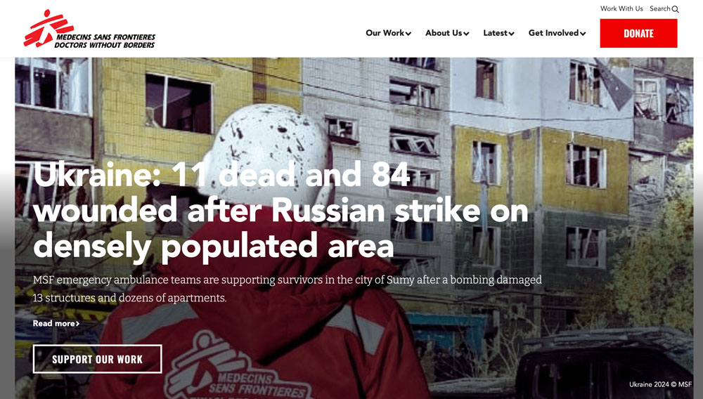
Grabs Attention Instantly
People process visuals much faster than text. A compelling hero image can capture attention in seconds and invite visitors to engage with your site.
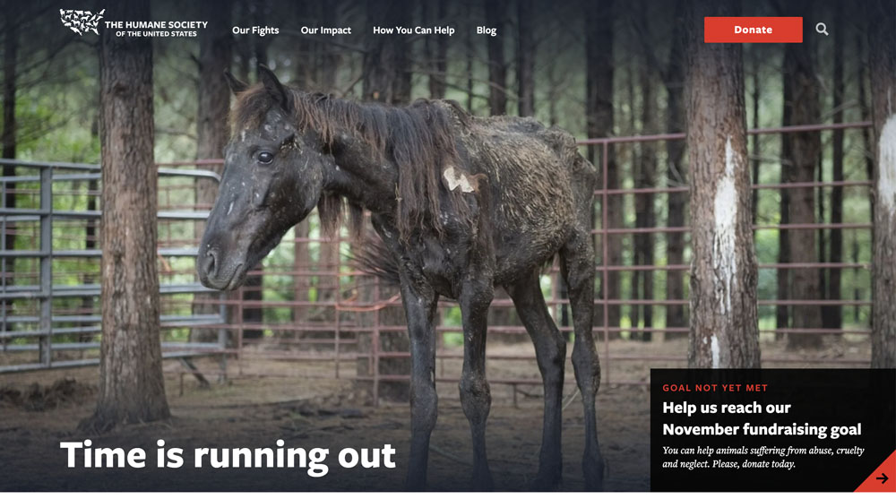
Conveys Emotion and Storytelling
A well-chosen image can evoke powerful emotions, making your mission feel real and relatable. For example, featuring people your organization has helped - tells a story that words alone can not convey.
Sets the Tone for Your Brand
The hero image is often the first visual representation of your nonprofit. It should reflect your values, purpose, and the communities you serve.

Supports the Hero Message
The hero image works in tandem with your headline and sub-message, adding depth and context. While the message explains, the image shows, creating a cohesive and impactful introduction.

Inspires Action
The right image not only captures attention but can also motivate visitors to take the next step—whether it’s learning more, donating, or signing up to help.
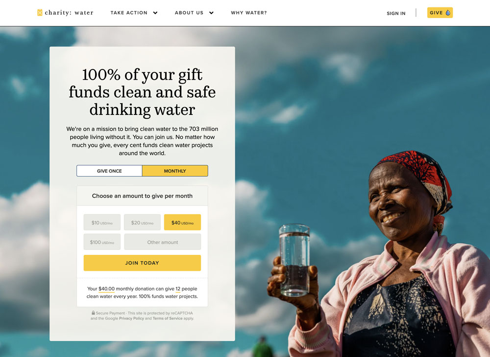
In short, the hero image is a visual gateway to your nonprofit’s story, complementing your hero message to create a compelling and memorable first impression. Together, they set the stage for visitors to connect with your mission and take action.
Mission: Where are you going?
The second section of your nonprofit’s homepage is the perfect place to build on the momentum of your hero message and answer the essential questions visitors may have. Think of someone visiting your site for the first time—they’re likely wondering:
- What’s the problem this nonprofit is tackling?
- What are they doing about it?
- What’s their vision for the future, and how will they achieve it?
Hopefully, the hero message approach you took inspired users to keep reading.
If you’re like the 90% of non-profit sites that fill this 2nd content section with something else like:
- Calls to Action
- Promotional content or articles
- Impact stats
- Services
- Annual reports
- Success stories
While many nonprofits use this space for a CTA, impact stats, or success stories, this might be an opportunity to put yourself in your audience’s shoes. For those unfamiliar with your work, this section should offer a clear and approachable explanation of your mission.
If your hero message didn’t explicitly outline your objective, this is the place to do it—but avoid jargon or simply copying your formal mission statement. Instead, translate your mission into clear, human language. For example:
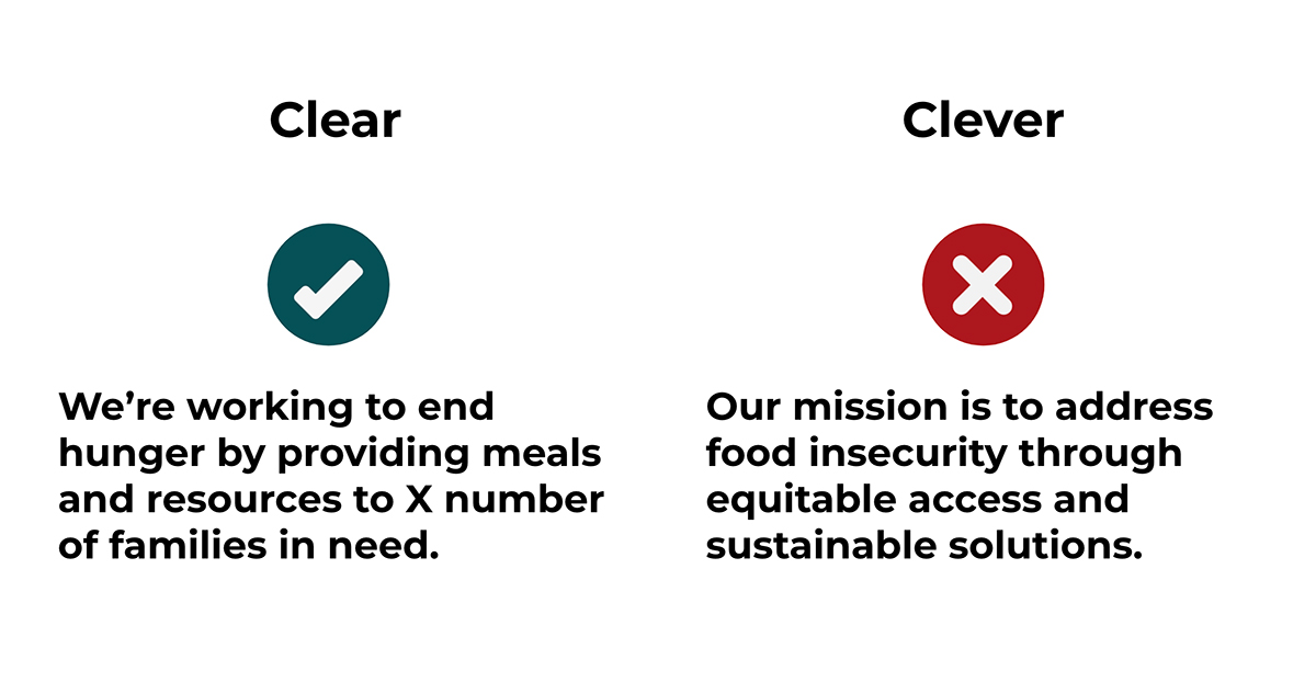
This section isn’t just about sharing what you do—it’s about helping your audience understand why it matters and inspiring them to join your mission. Done well, it keeps visitors engaged and motivates them to explore your site further, donate, or get involved.
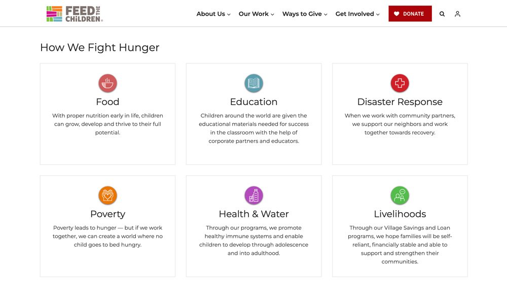
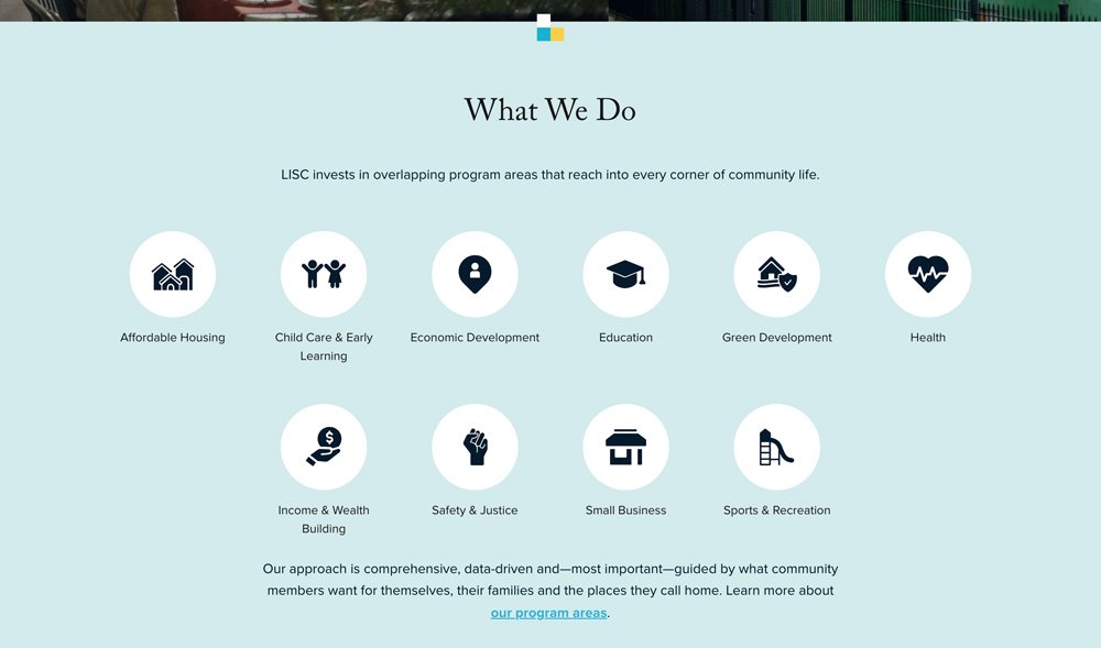
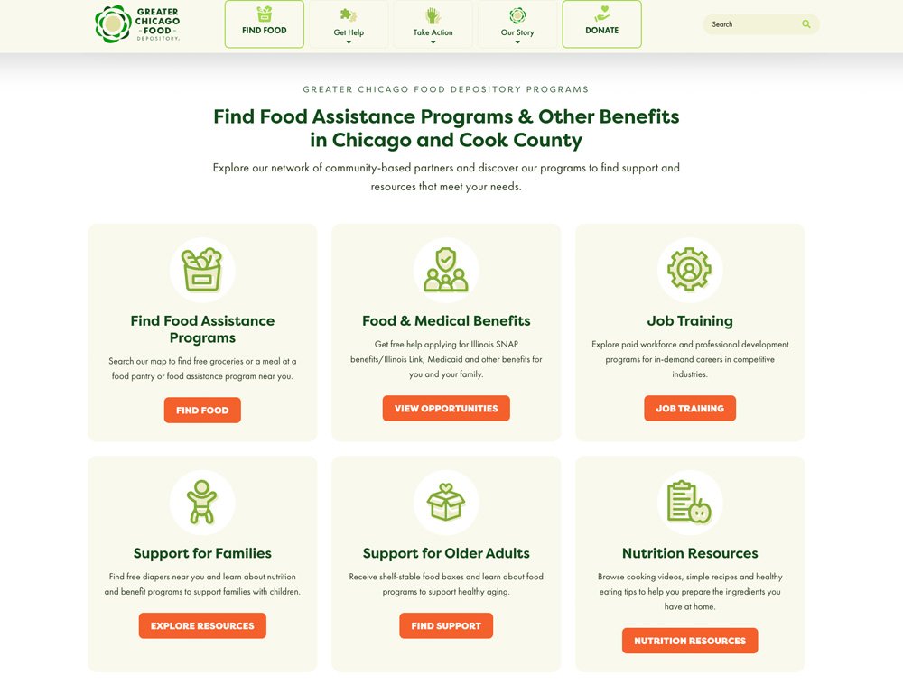
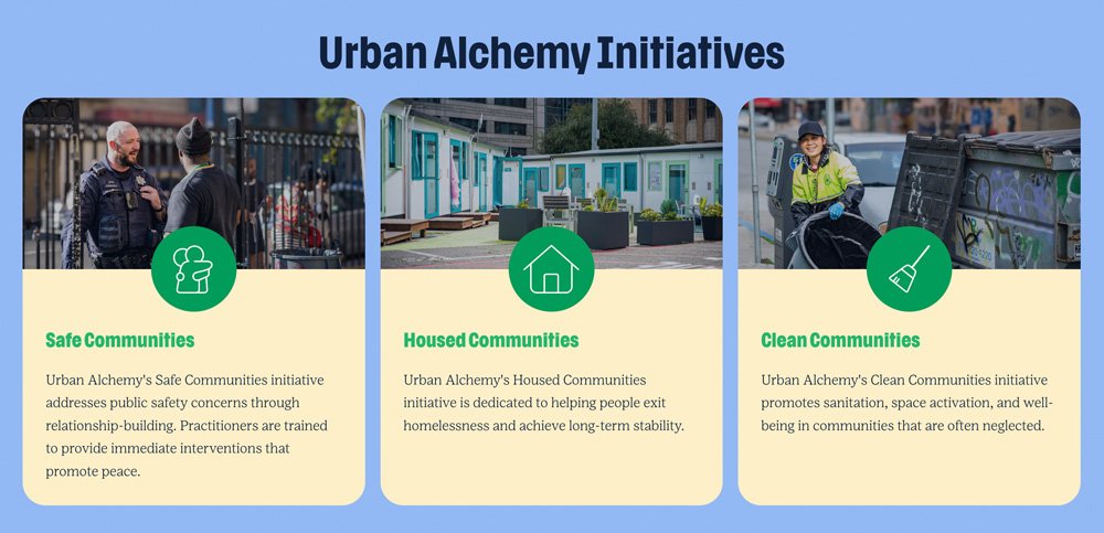
Services/Programs - How do you help?
Only 7% of nonprofits use the third section of their homepage to highlight services, but it’s one of the most effective ways to demonstrate how your organization makes a difference. While the mission, vision, or organizational story may appear earlier on the page, this section should focus on what you’re actively doing to address the problem.
What makes a strong services section?
- Keep it simple: Use clear, easy-to-understand language.
- Make it visual: Incorporate icons or images to break up text and enhance readability.
- Show impact: Tie your services directly to the benefits they provide for your community.
- Spark curiosity: Provide a snapshot to encourage visitors to explore more detailed service pages.
This isn’t the place for exhaustive details—save that for deeper dives on individual service pages. Instead, give a quick, engaging overview that answers the fundamental question: “How are you helping?”
By making this section approachable and visually engaging, you not only inform your audience but also reinforce your organization’s credibility and commitment to meaningful change. This clarity and focus invite further exploration and deepen user engagement.
Impact - What have you done?
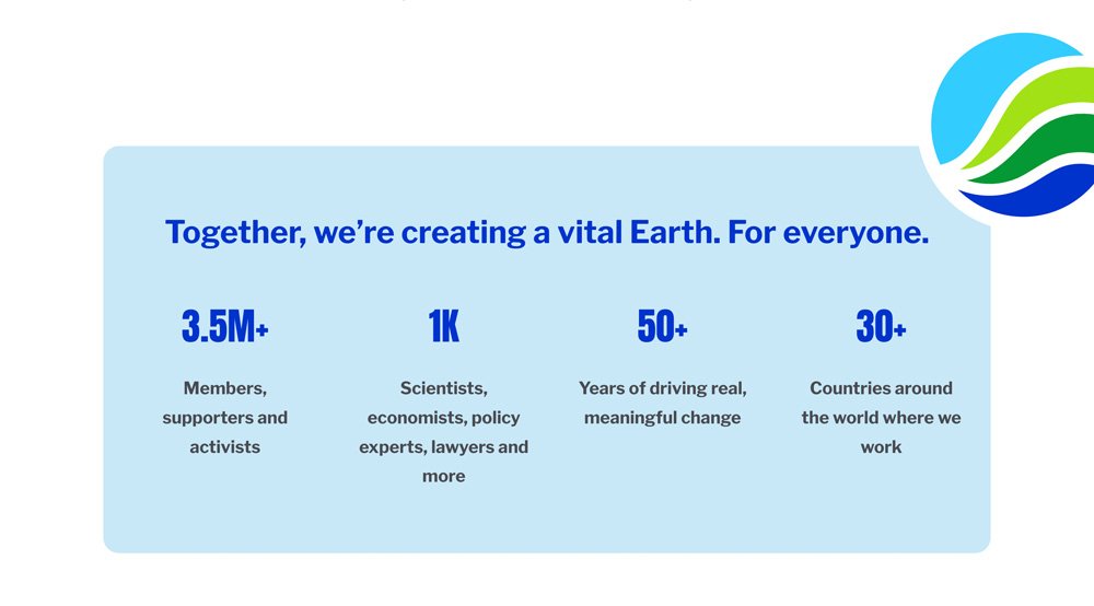
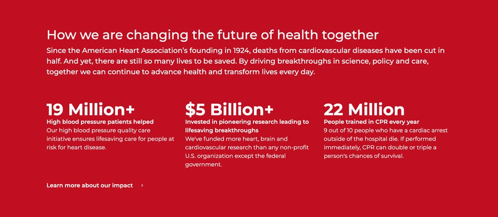
Impact statistics are your nonprofit’s proof of progress, showing visitors the tangible difference you’re making. Strategically placed, they transform your homepage from a mission statement to a compelling narrative of action and results.
Positioning these stats immediately after the problem and how your helping creates a powerful one-two punch: you identify the challenge, highlight how you help and then demonstrate what your organization has successfully been addressing it. This approach inspires confidence in your audience, whether they’re potential donors, volunteers, or advocates.
What makes impact stats effective?
- Style and Clarity: Use large, bold numbers paired with brief explanations to ensure immediate understanding.
- Emotional Resonance: Highlight the human side of your impact with stats that connect to real lives changed (e.g., "10,000 meals delivered to families in need").
- Visual Appeal: Incorporate icons, infographics, or bold typography to make your stats stand out and keep the page dynamic.
Impact stats aren’t just numbers; they’re a testament to your credibility and effectiveness. They reassure visitors that their support matters, motivating them to engage further—whether by donating, volunteering, or spreading the word.


Take Action - How can I get or give help?
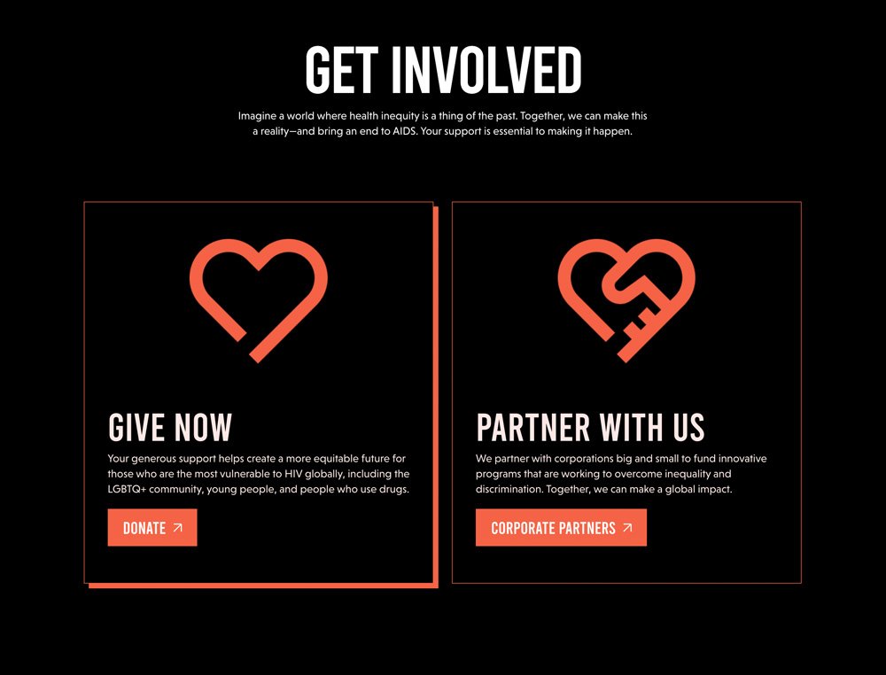
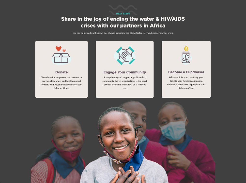
The Call to Action (CTA) is where your nonprofit turns interest into impact. This section should appear prominently—ideally in or immediately following the hero section—and also further down the homepage to reinforce engagement opportunities. A well-crafted CTA invites your audience to take meaningful steps, whether they’re seeking help or offering to support your mission.
Tailor Your CTA to Your Organization’s Focus:
- For Community-Based Nonprofits: If you address essential needs like housing or food, focus your initial CTA on how people can get help, such as "Find Resources" or "Get Support."
- For Advocacy or Environmental Groups: Encourage action aligned with your cause, like "Join Our Movement," "Sign the Petition," or "Support Clean Energy."
- Multiple Options: If you have diverse pathways for involvement, such as "Donate," "Volunteer," or "Learn More" then maybe that's the right way to go, but remember designing an impactful homepage is really about making tough marketing decisions.
Best Practices for an Effective CTA Section:
- Clarity and Simplicity: Use clear, action-oriented language like "Help End Hunger Today" or "Get Involved Now."
- Highlight Urgency: Tie CTAs to immediate needs or goals to motivate action, such as "Donate by December 31 to Double Your Impact."
- Incorporate Visuals: Buttons, icons, stats or eye-catching graphics can draw attention to your CTAs and make them more inviting.
By strategically positioning your CTAs and tailoring them to your nonprofit’s priorities, you empower visitors to act in ways that align with their interests and your mission—whether it’s giving help, getting help, or joining your efforts.

Stories + Social Proof - Who have you helped?
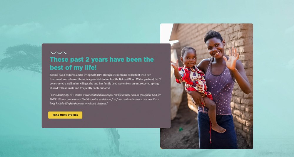
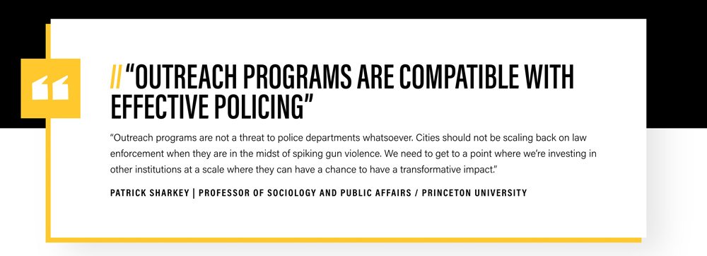
Testimonials are one of the most powerful tools your nonprofit can use to build trust and credibility. While you can tell your audience about your work, testimonials let others—those who’ve directly benefited from your organization—speak to your impact in a way that’s both authentic and persuasive.
Testimonials tap into the power of conformity bias—the natural human tendency to follow the lead of others. When potential supporters see stories of people like them finding real value in your nonprofit’s work, it removes doubt and makes action feel safe and compelling. Just as you might decide to share a dessert at dinner because your friends are doing it, testimonials reassure visitors that supporting your cause is a choice others like them have already made
5 Best Practices for Effective Testimonials:
To maximize the impact of your testimonials, include these key elements:
- Headline: Highlight the key takeaway or emotion.
- Quote: Share the individual’s direct experience in their own words.
- Photo: Humanize the story with a relatable face.
- Name + Title: Add context and authenticity with the person’s details.
- Client Name or Partner Logo: Reinforce credibility with the client name or organizational affiliation, if applicable.
Where to Place Testimonials:
Pepper testimonials throughout your homepage. Use them to reinforce your mission, highlight the value of your services, and support your calls-to-action.
When done right, testimonials take abstract concepts—like trust or impact—and make them tangible, showing your audience that real people are benefiting from your work. It’s not just about telling your story—it’s about letting others tell it for you.


Avoid Testimonial Overload: Let Each Story Shine
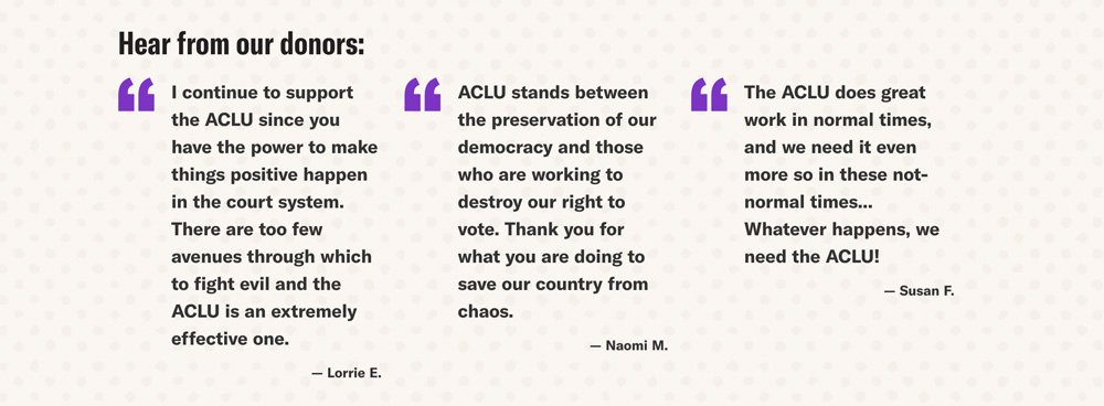
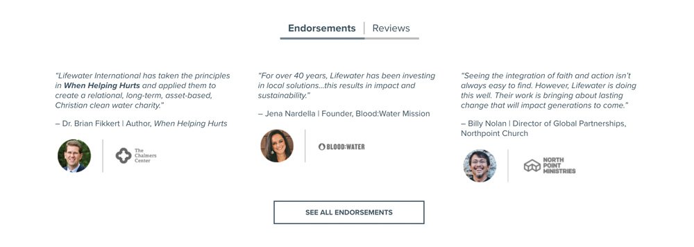
While testimonials are powerful, nonprofits should carefully consider how they present them. Using testimonial parades or carousels to showcase multiple stories in one section can dilute their impact and even make them feel like ads, a common trap that leads to banner blindness—when visitors unconsciously ignore content that looks promotional.
Instead, let each testimonial stand alone in its own dedicated space. This ensures visitors can fully engage with each story and connect with the real-life impact of your work. When testimonials are presented individually, they feel more authentic, personal, and trustworthy, which is critical for building credibility and encouraging action.
By avoiding the ad-like feel of carousels and focusing on one story at a time, you’ll highlight the genuine value of your work while maintaining the emotional resonance that makes testimonials so effective. Remember, quality storytelling beats quantity every time.
Promotional - How are you leading?
The promotional section of your nonprofit homepage is an excellent opportunity to demonstrate how your organization is leading in its field.
Whether your focus is educating your audience, celebrating accomplishments, or sharing resources, this section allows visitors to see the depth of your work and expertise.
What can you include here?
- Articles: Share insights.
- Awards: Highlight recognition that validates your mission.
- Grant Opportunities: Feature funding options.
- Events: Promote upcoming opportunities for engagement.
- News: Showcase important milestones or media coverage.
- Podcasts: Offer thought-provoking conversations.
- Resources: Provide downloadable guides, reports, or toolkits.
- Thought Leadership: Feature op-eds that position you as an authority.
If one of your website’s goals is to inform or educate, this section is a fantastic way to engage visitors who are just starting to learn about your organization. Not everyone landing on your homepage will fully understand what you do—offering diverse types of content gives them multiple ways to connect and build a clearer picture of your mission.
Design Tip: Consider showcasing your most recent blog posts, news stories, or podcasts in a visually appealing grid or list format. Keep the content concise, with links to learn more, so visitors can quickly explore the topics that interest them.
Promotional content isn’t just about self-promotion—it’s about establishing credibility, fostering engagement, and demonstrating the impact of your leadership.
Area(s) - Where do you serve?
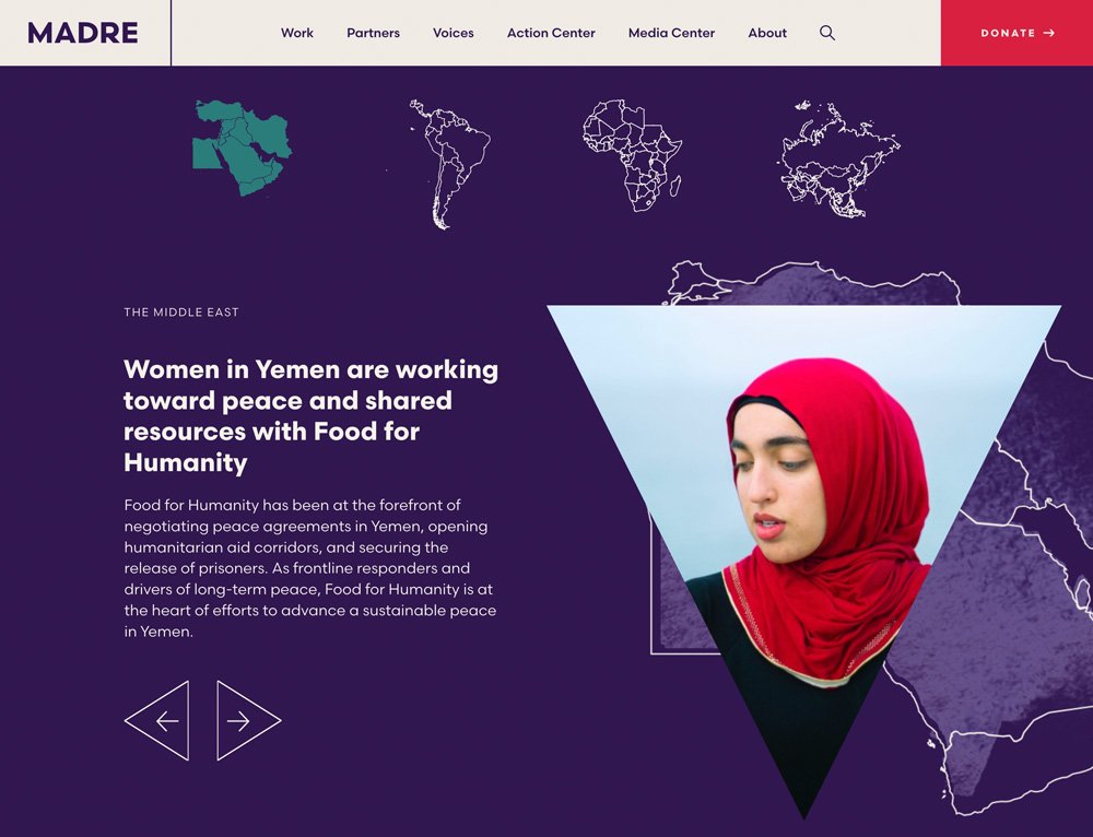
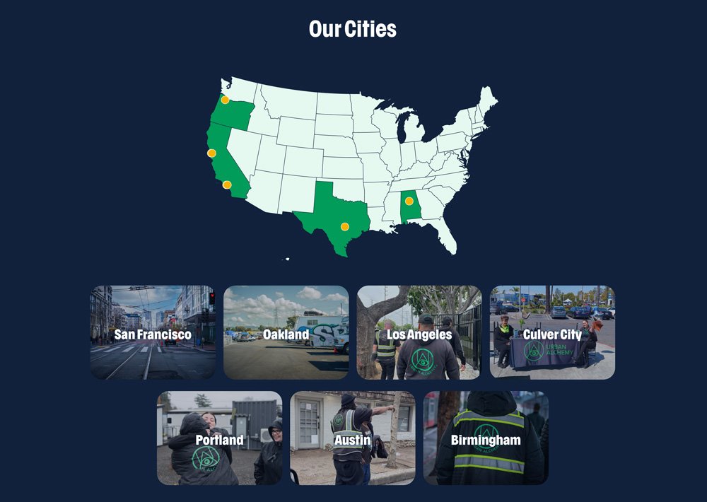
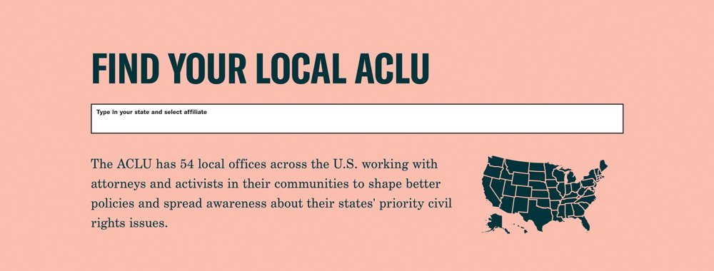
A Service areas section is a vital part of your nonprofit’s homepage. It clearly communicates where your organization operates—whether it’s within a specific neighborhood, across a state, multiple states, or globally. By defining your reach, you help visitors quickly understand the scope of your impact and connect with your mission in a tangible way.
Benefits of a Service Areas Section:
- Visualize your impact
- Contextualize your scale
- A way to interactively engage your audience
Why This Section Matters
Wrapping up your homepage with a Service Areas section is the perfect way to leave visitors informed and inspired. By answering key questions like “Where do you work?” and “What’s happening in my area?”, you encourage deeper engagement with your nonprofit. Whether it’s donating, volunteering, or exploring further, this section invites your audience to take the next step with confidence.

Summary of the Elements for an Effective Nonprofit Homepage
1. Hero Message + Image: Why Does This Matter?
This is the first impression and should grab attention instantly. Pair a clear and concise headline with a compelling image that reflects your mission and invites emotional connection. Avoid generic welcomes—focus on your organization’s purpose or the problem you’re solving.
2. Mission: Where Are You Going?
Build on the momentum of your hero section by explaining your mission in plain, relatable language. Avoid jargon and highlight what your nonprofit is doing to address key issues and create change.
3. Services/Programs: How Are You Helping?
Showcase the work you do with a brief, engaging overview of your services or programs. Use visuals like icons or photos to make the content easy to understand and inviting.
4. Impact: What Have You Accomplished?
Use bold statistics, infographics, or short narratives to show the tangible results of your work. This reassures visitors of your effectiveness and motivates them to support your efforts.
5. Take Action: How Can I Get Help or Give Help?
Include clear calls-to-action (CTAs) that align with your goals. Whether it’s donating, signing up for events, or accessing resources, make it easy for visitors to take the next step.
6. Social Proof: What Do Others Say About You?
Feature testimonials or stories from those who have benefited from your work. Let real voices speak to your impact, building trust and credibility.
7. Promotional Content: How Are You Leading?
Highlight your thought leadership with articles, awards, podcasts, or resources. Use this section to show your expertise and leadership in your field, engaging both new visitors and returning supporters.
8. Service Areas: Where Do You Serve?
Clearly define the geographic areas your nonprofit impacts, whether local, regional, or global. Use maps, stats, or visuals to contextualize your reach and inspire confidence in your work.
Why an Effective Homepage Matters for Your Marketing Team
Your homepage isn’t just a digital placeholder—it’s the beating heart of your nonprofit’s online presence. This is where first impressions are made, trust is built, and action begins. Anyone can slap words on a page, but a truly powerful homepage transforms passive visitors into passionate supporters.
Think of it as your virtual front door: every image, every word, every call-to-action should work together to guide visitors on a journey—from curiosity to commitment. A well-crafted homepage doesn’t just inform; it inspires. It answers the questions your audience didn’t even know they had, draws them into your story, and compels them to take meaningful action.
Your homepage has the potential to educate skeptics, rally believers, and amplify your mission in ways that ripple far beyond the screen. Don’t settle for mediocre—make it a gateway to change.