13 Non-Profit Web Design Trends 2025
Non-profit work is a dynamic journey where marketing and web design play a vital role. Web design trends evolve swiftly, and new social media can platforms crop up regularly.
However, it's crucial to recognize that success doesn't hinge on chasing every trend. Instead, your true compass is the feedback and preferences of your supporters and audience.
Consider their preferences.
- Do they lean towards a clear mission statement, or do they prefer a subtler touch?
- Are they responsive to pushing boundaries, or do they gravitate towards more traditional approaches?
Listening to your supporters holds the key. By heeding their cues, you can shape marketing and web design that resonates genuinely. This approach shows that you not only comprehend their needs but are committed to making a tangible difference.
This is still a competition
Non-profits might not have competition in the traditional sense, but they are competing for attention. And most potential supporters or donors can't tell the difference between the best-performing non-profit and the best-marketed one. So it's essential to ensure your marketing and web design is top-notch.
If you're in the process of a website redesign, here are some non-profit web design trends that would be worth being aware of:
Bold + Clear Brand Message
Let's break free from alphabetical order, as this is truly pivotal – a beacon that warmly welcomes your visitors and engraves your mission.
Imagine this
Not every soul that steps onto your non-profit's website is already carrying the torch of passion for your cause. That's where the magic of a clear, crisp brand message comes into play. It's a symphony of words that dances through the airwaves, resonating with your chosen audience.
Your brand message, that eloquent introductory handshake, is a canvas to paint a fresh perspective. It's that "aha" moment that leaves them in awe of the symphony you're orchestrating in the world.
Now, if you're satisfied with your circle of supporters, you're golden. You could delve into the depths of jargon, and revel in more insider language – the tribe gets it, after all.
But let's dream big. Let's stir hearts and illuminate minds, transcend our comfort zones. Let's shatter the walls of our echo chamber and extend an invitation to the curious minds wandering outside.
Your brand should be on a mission
If your mission is to transform hearts and kindle new sparks, then it's time to be a linguistic alchemist. Let your words be a bridge to aspirations, an elixir to doubts, a nudge to apathy, a whisper to hesitations, a boulder rolling over preconceived notions. It's about catching those "not yet" supporters in your embrace.
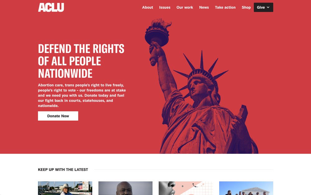
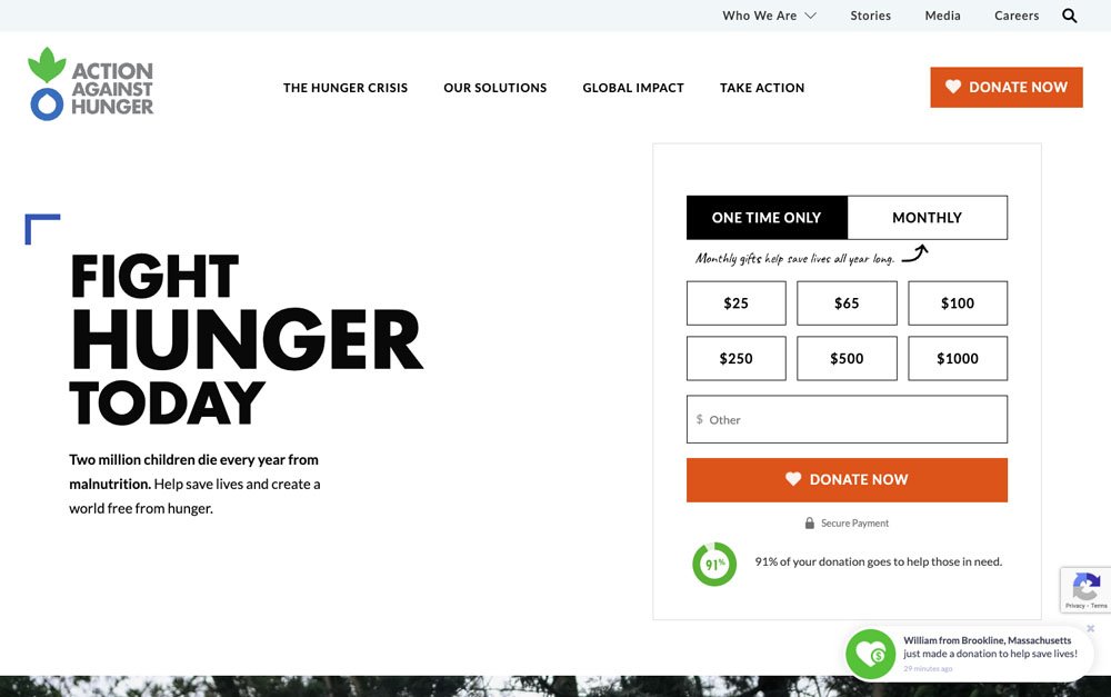
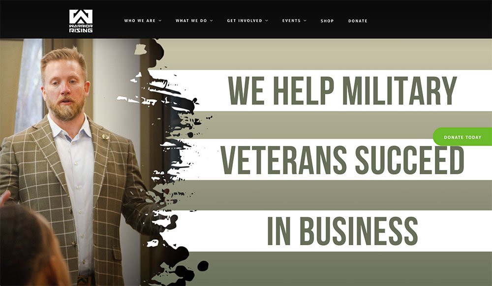
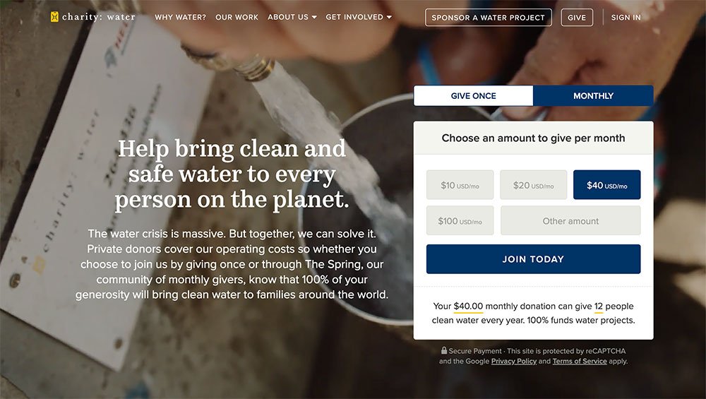
Look to the ACLU, Action Against Hunger, and Warriors Rising – they encapsulate their brand message in seven words or less, a testament to succinct eloquence. And even if Charity Water's message stretches a tad, they just might need to change their name to Clarity Water.
So, let's embrace the power of potent brand messaging. It's the sunrise that greets every new day of advocacy, and the symphony that lingers even after the curtains fall.
Big Stats
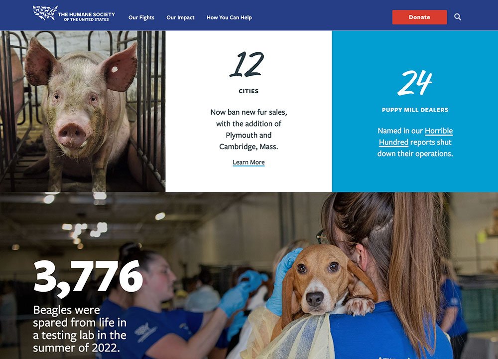
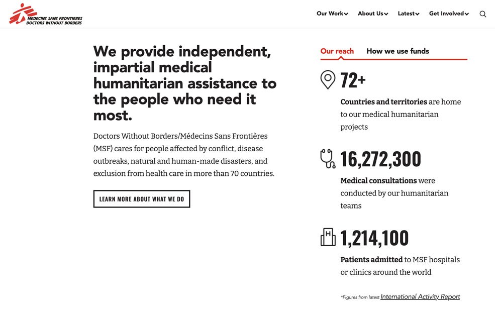
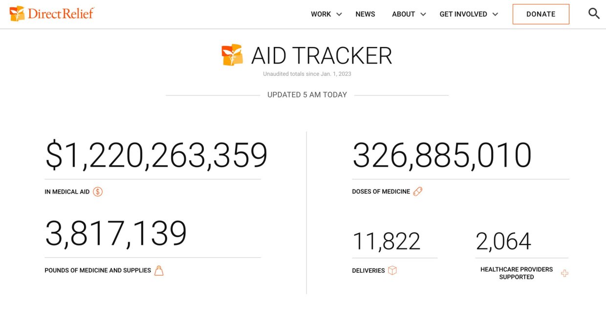
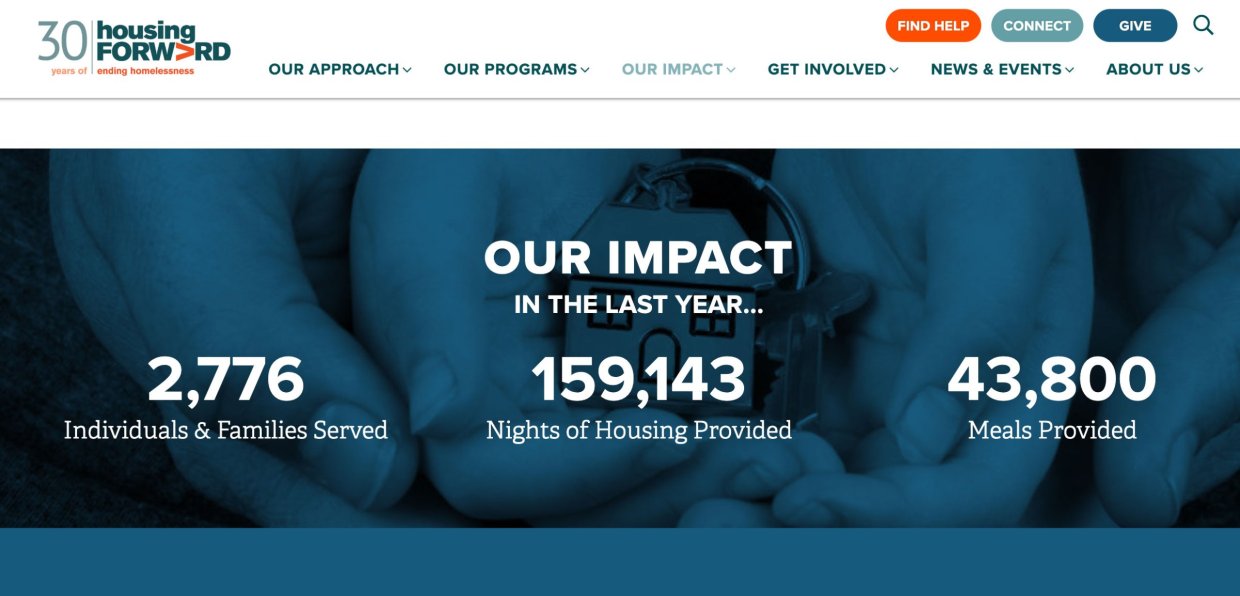
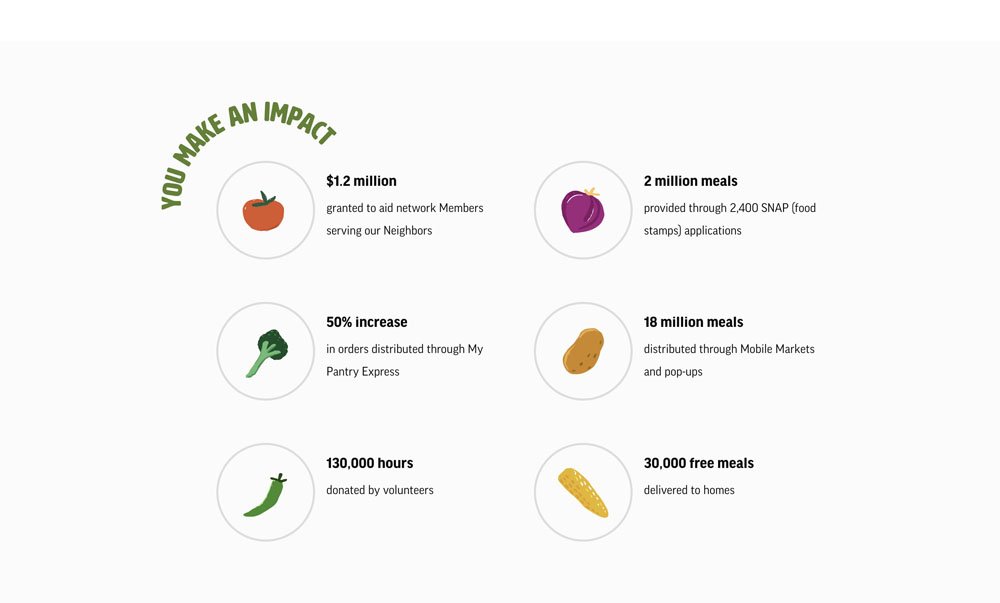
Non-profit websites are becoming exceptional storytellers, and an intriguing aspect of this narrative artistry revolves around the use of statistics.
These numbers appear in various forms, each adding a unique layer to the unfolding tale:
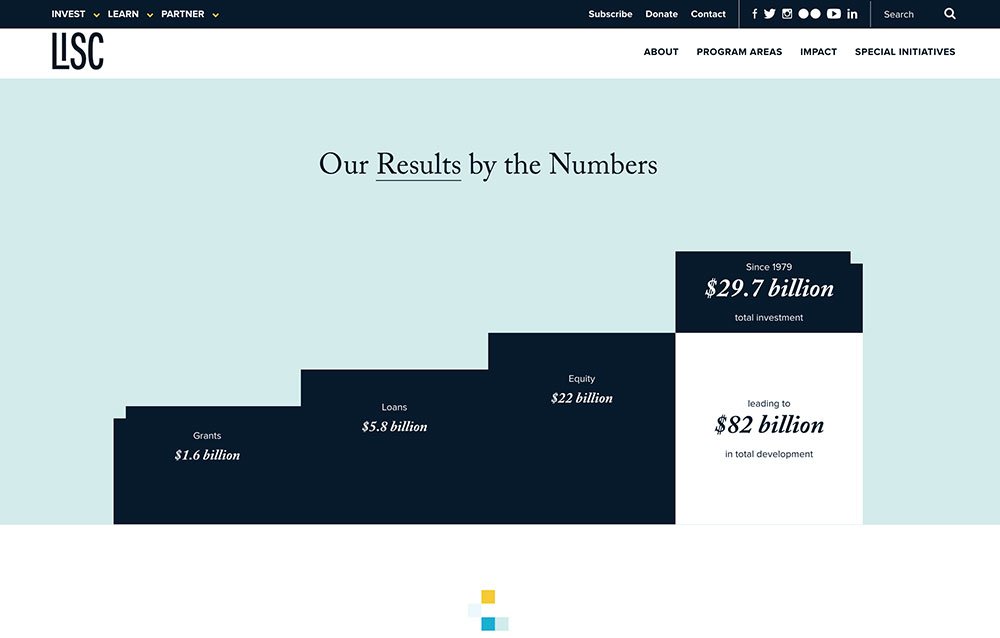
- Impact Stats: Show the impact that the organization has made
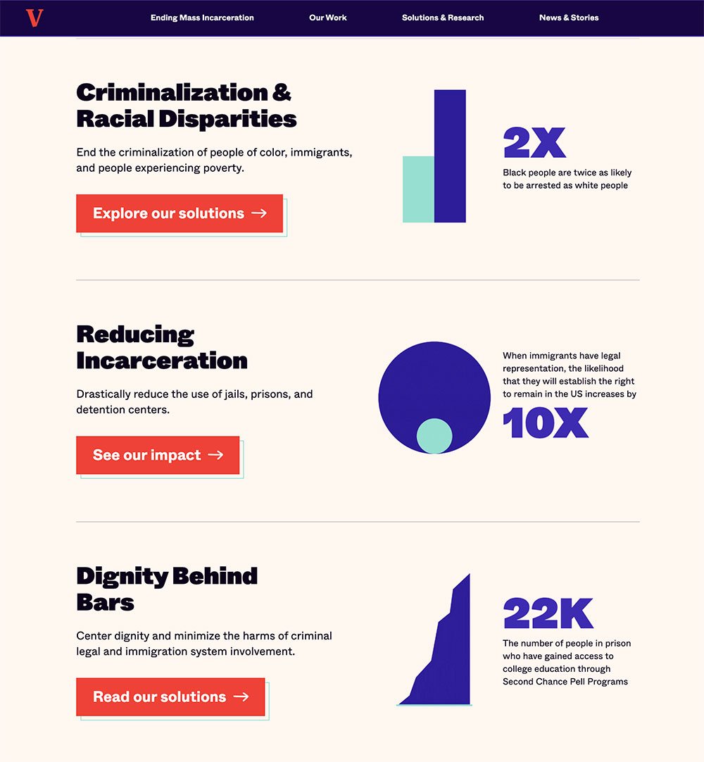
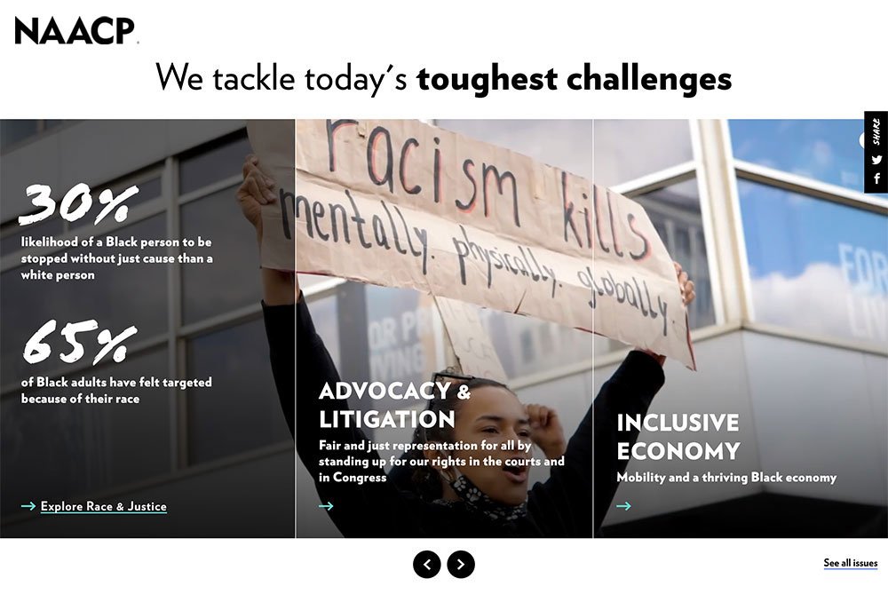
- Problem Stats: Attempt to contextualize the scale of the problem the organization is trying to solve
- Hybrid Stats: Attempt to frame the problem and then dive into their impact
- Goal Stats: These stats declare their target impact goals
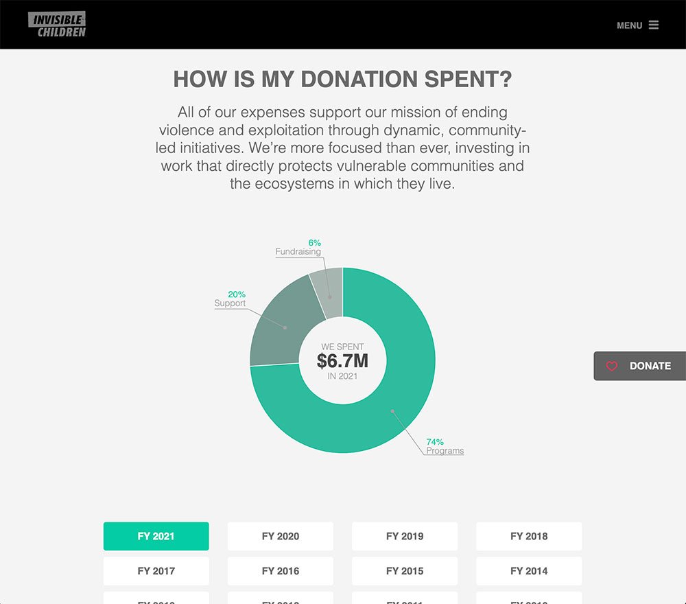
- Fund Usage Stats: Highlight how donations are utilized
- Obscure Stats: Numbers that might be exciting to the organization, but they are hard to understand
In the realm of non-profit web design, there isn't a single formula for wielding the power of statistics. The magic lies in how these numbers weave into your narrative. Whether you:
- Shine a spotlight on your impact
- Lay bare the magnitude of a problem
- Fuse challenge and triumph
- Set audacious goals
- Reveal the pathways of fund allocation
It's your story to tell. Through these stats, you transcend data and charts, touching hearts and minds and igniting a collective spark of change.
Sites Using Impact Stats
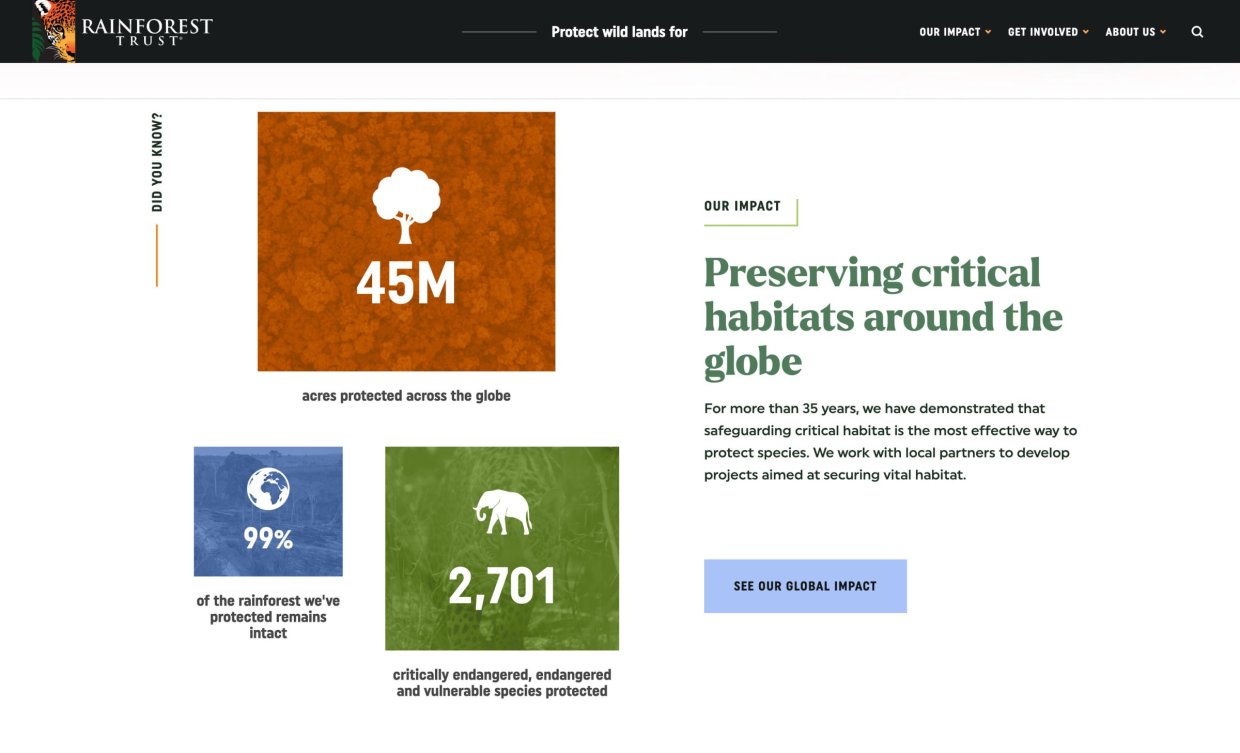
These are like spotlight moments showcasing the ripples of positive change a non-profit has set in motion. It's not just numbers; it's a symphony of transformation woven into digits.
Organizations like The Humane Society, Doctors Without Borders, Direct Relief, Housing Forward, and the Rainforest Trust have mastered the art of turning data into impactful narratives.
Non-Profits Using Problem Stats
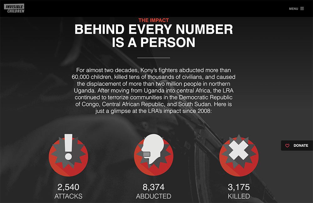
Imagine presenting a challenge in a way that leaves jaws dropping and minds racing. Problem statistics build the foundation of awareness, painting the canvas with the vastness of the issue at hand.
While some may hesitate to wield these stats, fearing they might overwhelm their audience because these stats can make the problem seem insurmountable, organizations like Vera Institute, NAACP, and Invisible Children have boldly embraced them to ignite conversations and understanding.
Hybrid Stats: Problem + Impact
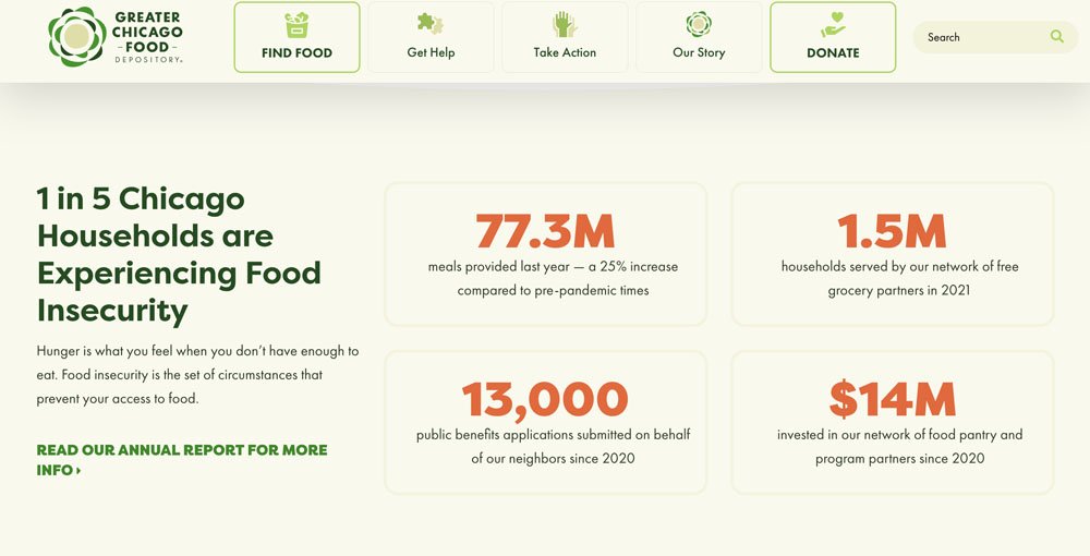
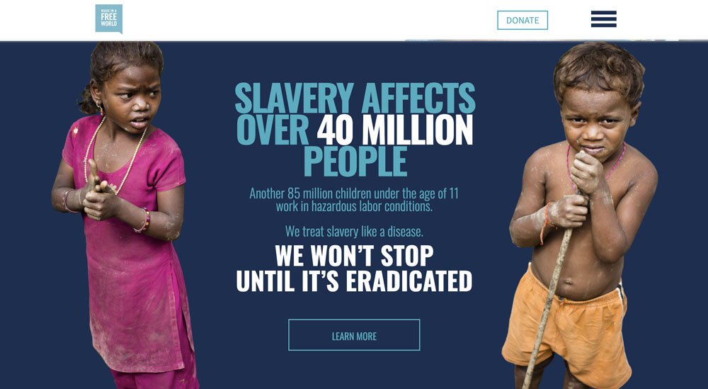
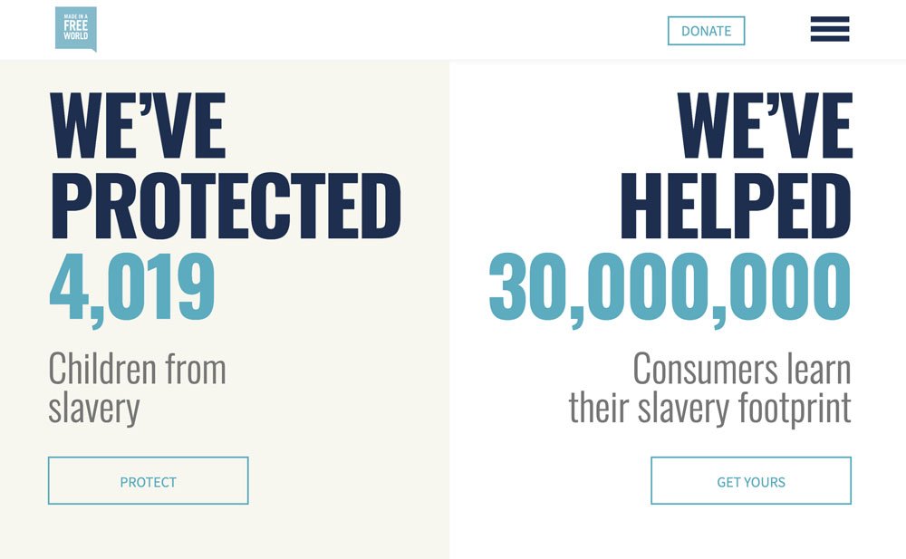
This approach is akin to revealing the puzzle's pieces while sharing the masterpiece that they collectively form.
Non-profits blending problem stats with glimpses of their impact invite supporters, skeptics, and the curious on a comprehensive journey.
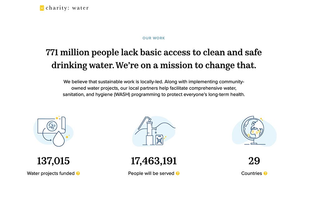
The Chicago Food Bank, Made Free, and Charity Water each employ their unique spin on this method, revealing a harmonious blend of challenge and triumph.
Goal Oriented Stats
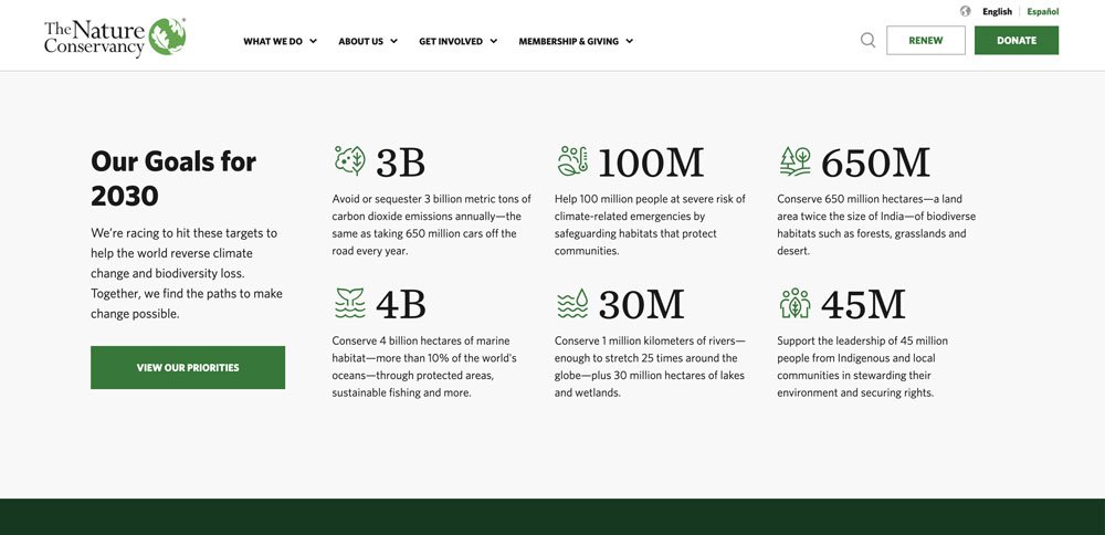
A rare few unveil their ambitions like a flag waving proudly against the wind. These sites not only declare what they aim to achieve but also carve out a roadmap of quantifiable goals.
This audacious stance evokes clarity, purpose, and motivation. It's like setting a bold intention, an invitation to join a cause with a clear destination in sight. A big thanks to the Nature Conservancy for letting us dream with them.
Fund Usage Stats
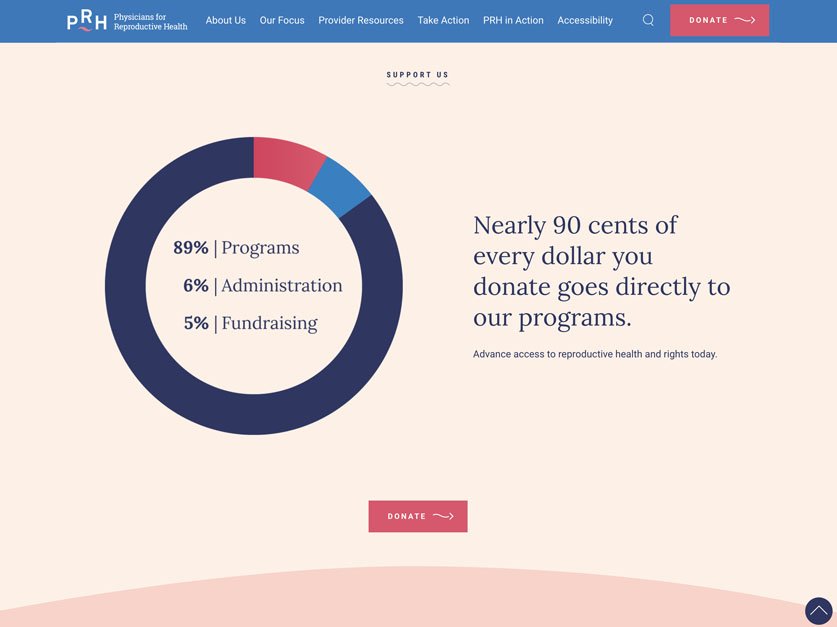
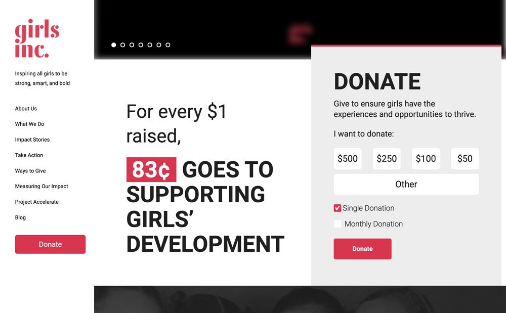
The transparency of financial utilization serves as a cornerstone of credibility.
Non-profits reveal how funds are channeled, highlighting the dedication to maximizing resources for programs and services. This, in turn:
- Breeds trust
- Attracts support
- Underscores their commitment to crafting a brighter world.
Physicians for Reproductive Rights, Girls Inc, and Invisible Children all decided this story was worth being told.
Clear vs Cluttered Navigation
When it comes to website navigation, non-profits have a golden rule to keep things smooth sailing:
- Balance Creativity: While creativity is wonderful, avoiding excessiveness is key. Stay true to clarity and purpose to prevent navigation from becoming a bewildering maze.
- Sensible Options: It's tempting to pour all your offerings into the navigation, but a concise selection is your compass. Each option should be a lighthouse, guiding users effortlessly.
In crafting navigation, the quest for clarity is paramount. It's an intricate dance, especially when different team members share their visions for organizing it. Amid this, the user's perspective is the North Star. Their journey should be seamless and rewarding. Plus, Google now factors user experience into their ranking system, underscoring the value of simplicity.
Clear Navigation Examples
Consider this: users visit your site amidst a sea of commitments. They're here to stand by you, even with a myriad of tasks at hand.
Catering to them isn't just courteous; it's the bedrock of your mission. Ensuring they can accomplish their tasks effortlessly is the least we can do. And if we can embellish their experience with avenues to explore our extensive endeavors, even better. However, let's not overlook the vital significance of a stellar navigation experience.
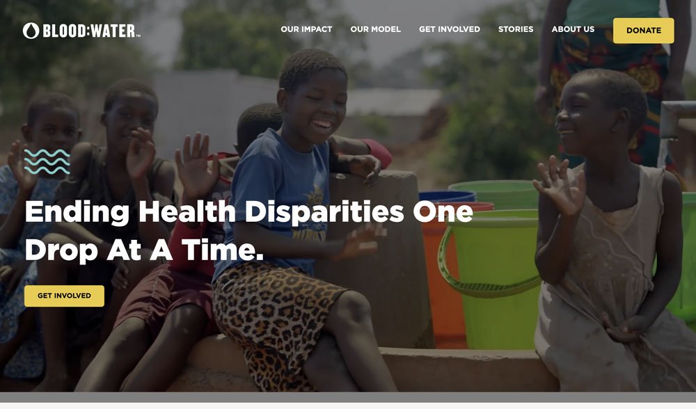
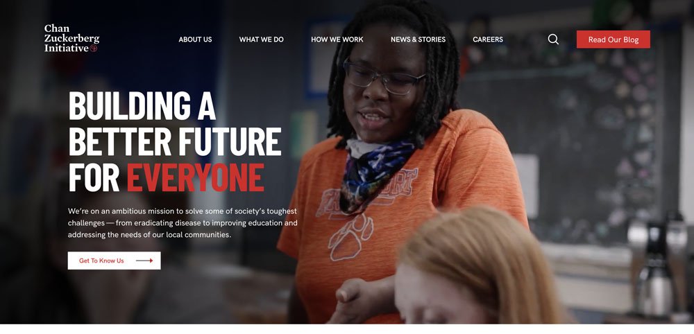
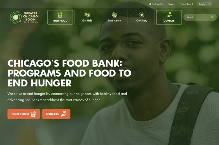
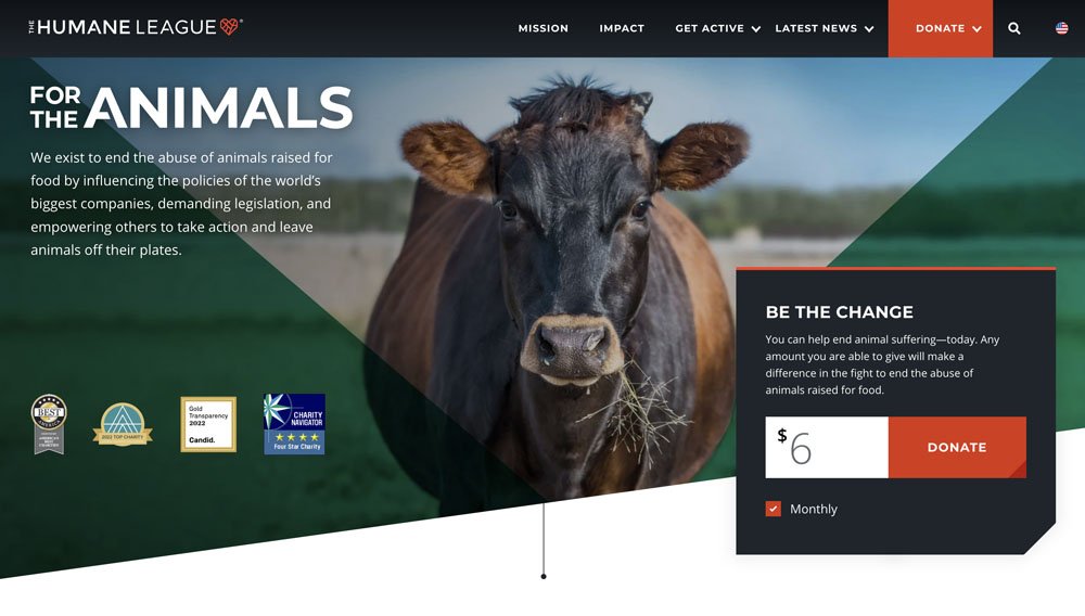
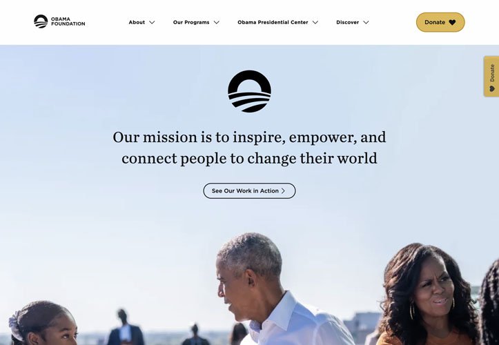
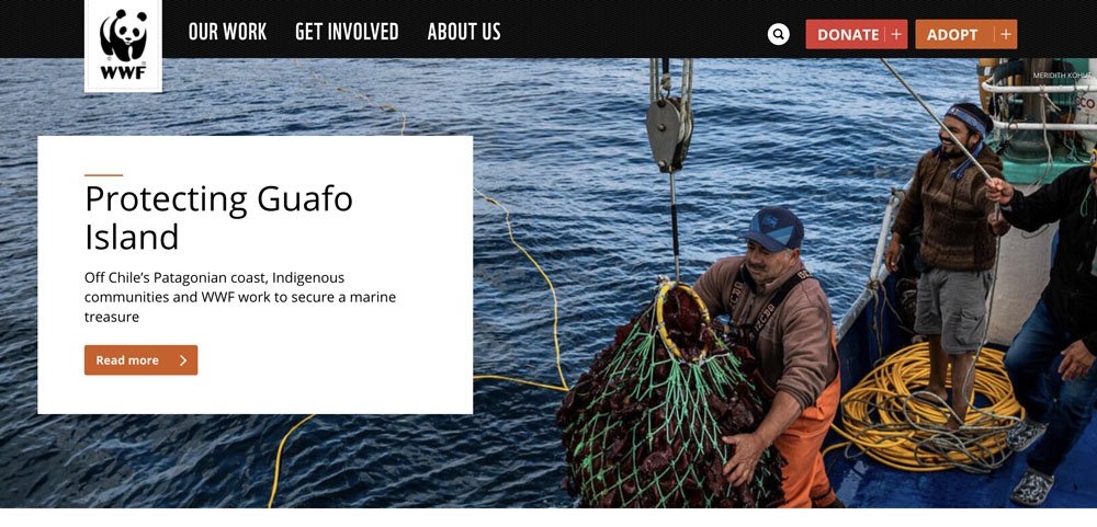
Take inspiration from the likes of Chicago Food Bank, The Humane League, The Obama Foundation, World Wildlife Fund, and Blood Water, who have masterfully woven clear navigation into their web journeys.
Cluttered Navigation Examples
On the other side of the coin, cluttered navigation can be a daunting tangle. Non-profits, in their quest to deliver comprehensive information and engage diverse audiences, sometimes tread the line of overwhelming their visitors.
It's a classic tug-of-war between providing information and maintaining navigational order.
We observe that sometimes the path of navigation can get treacherous when content organization takes a backseat.
At the heart of it, marketing involves making tough choices. It's our job to make these decisions, allowing our visitors to navigate effortlessly, immersed in the heart of our cause.
Clear CTAs "Call To Action"
A thoughtfully crafted "Call to Action" (CTA) is like extending a helping hand to your site visitors, making sure that the individuals your non-profit stands for can access what they need with ease.
Think about it – whether they're:
- Someone seeking assistance
- A supporter keen on volunteering
- Or a generous soul ready to donate
- A new friend looking to hear what we're up to
It's about creating clear pathway that are effortlessly discoverable, whether it's nestled in the main navigation, the footer, or passively sticky to one part of the page.
Let's envision some polished Calls to Action
- For those in search of help, consider offering tailored options based on their specific needs.
- For the kind-hearted supporters yearning to lend a hand, let's illuminate a path.
- For the benevolent donors looking to make an impact, let's make the way clear.
- For new friends signing up to receive emails, let's let them know what and how often we publish.
By curating a clear and visually appealing CTA, non-profits can craft a virtual gateway, ensuring that those who need assistance, wish to engage, or are driven to contribute can do so without any struggle.
In this simple act, lives can be transformed, and the mission of the non-profit can shine brighter. One aspect to bear in mind is keeping the main navigation clutter-free, ensuring that this welcoming signpost stands out, and guiding visitors with a warm embrace.
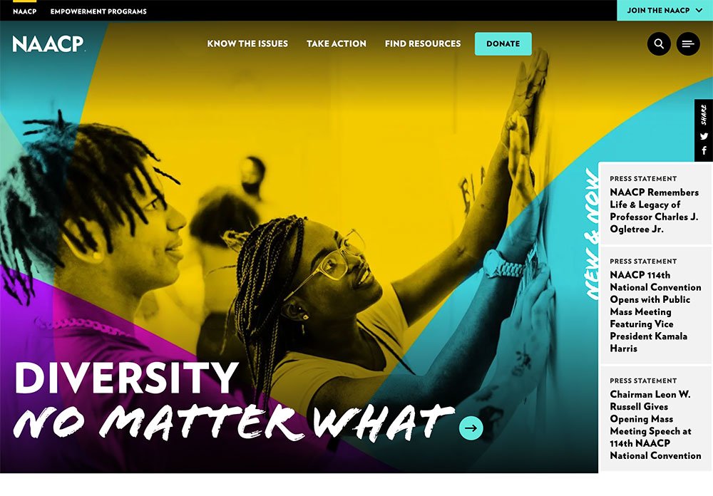
Colorful Gradients
Gradients, those vibrant bursts of color that once ruled the digital kingdom in the early 2000s, decided to take a bit of a hiatus when flat design took the stage in the early 2010s.
But guess what?
They're back, and they're here to paint the digital canvas with a kaleidoscope of possibilities, gracing everything from web design to product packaging.
Talk about a comeback story! Gradients aren't just a nostalgic nod; they're a design trend that's breathing new life into digital landscapes.
Beware of Accessibility Issues
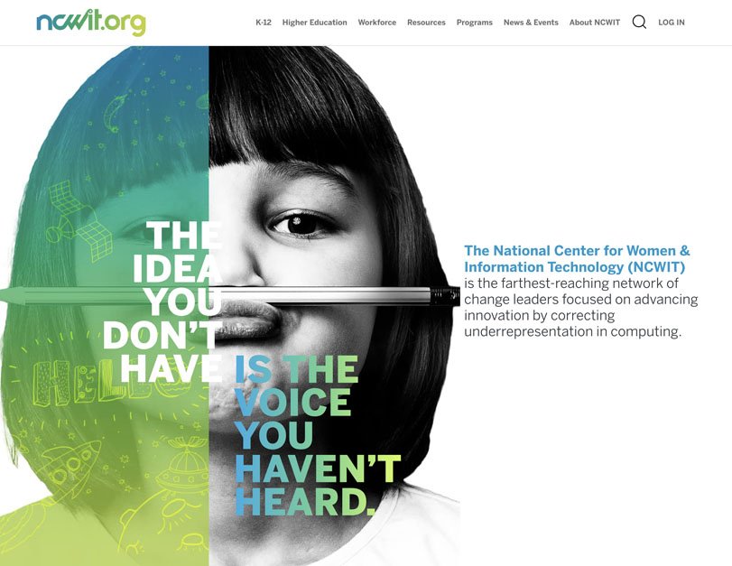
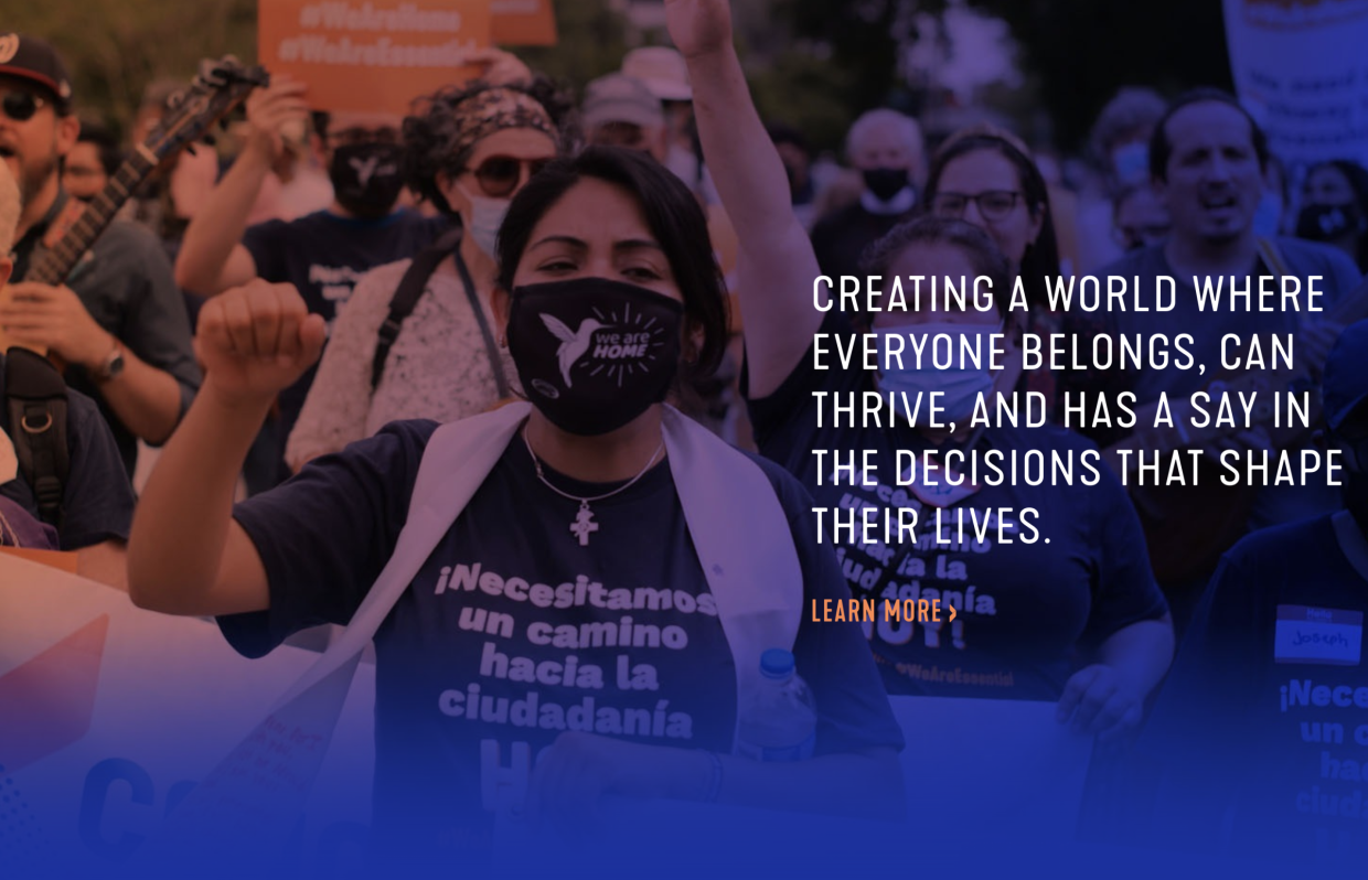
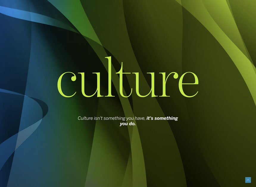
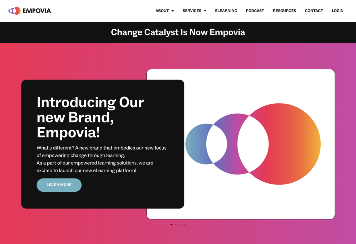
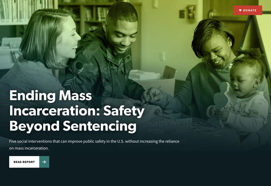
When wielded with the finesse of a seasoned artist, gradients add an enchanting dimension to design. They're the secret ingredient that can transform a digital vista into a captivating journey. But, let's be mindful – just like a dash of spice can elevate a dish, too much can overpower it. Gradients are no different; they shine brightest when used judiciously.
And let's not forget our tech-savvy friends with varied accessibility needs. An overload of gradients or colors that buzz a bit too much on the screen might lead to accessibility challenges.
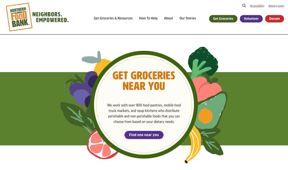
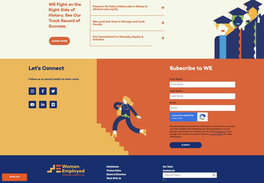
Custom Graphics
These bespoke visual elements aren't just mere decorations; they're potent tools that can amplify your brand's recognition and shape an unforgettable encounter.
In a landscape where every non-profit is painting its own canvas of impact, custom graphics become your signature brushstrokes. They infuse your online presence with a touch of originality that's impossible to ignore. This is no mere frivolity; it's a strategic move to etch your name in the memory of those who matter.
Custom Imagery
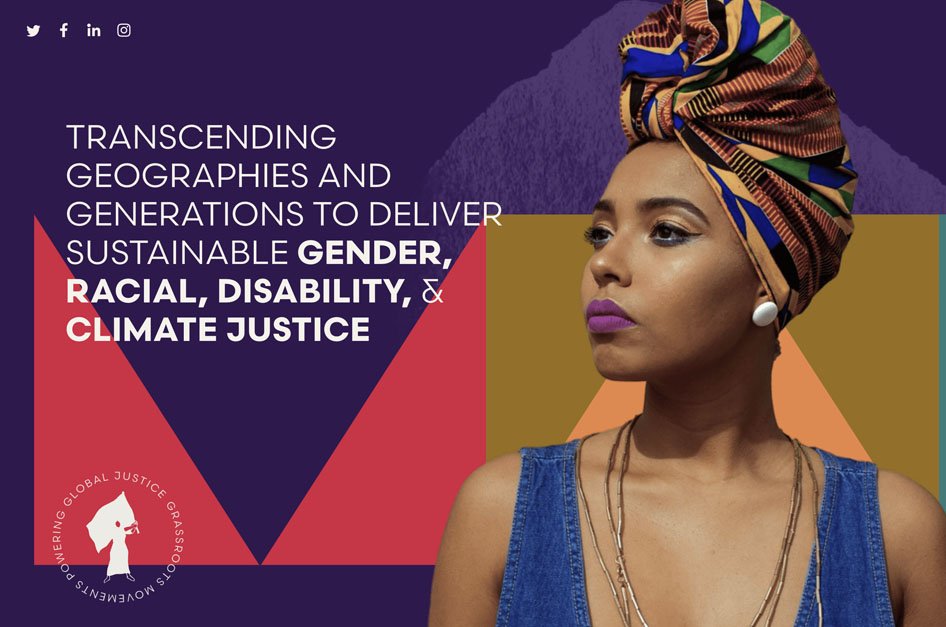
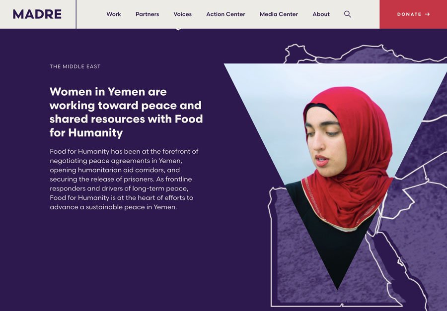
This is a bit of a universal trend, it's a shift from generic stock photos to the captivating realm of custom visual storytelling. This change is far from arbitrary; it's a strategic move that amplifies authenticity and engagement.
And even when they are using stock or custom images, put an exciting twist on them and take it a step further. They're not just settling for good visuals; they're elevating them with ingenious techniques:
- Cut-outs: Slicing out images from their backgrounds and placing them in contexts that make your narrative pop.
- Gradients: Adding color gradients that seamlessly merge, casting a spell of creativity.
- Layering: Infusing images into graphics or layer text on top, creating an interactive visual feast that beckons exploration.
Remember to Compress Your Images
Remember, as you embark on this visual journey, keep a crucial detail in mind: image compression. It's like giving your visuals a turbo boost. Images that load faster not only delight your visitors but also escape the Google speed radar. Slow websites can lead to penalties, and we don't want that, do we?
Free Compression Tools
Lucky for you, there are a host of user-friendly tools waiting to lend a hand:
- Image Optim: A nifty compression tool for Mac users.
- TinyPNG: A free online treasure trove for image compression.
- EZGif: Perfect for compressing animated gifs.
Incorporating these tools into your content workflow ensures that your visuals shine without weighing down your website
Easy Donation Experience
Choosing the right donation software is no small feat – the intricacies are too many to capture here.
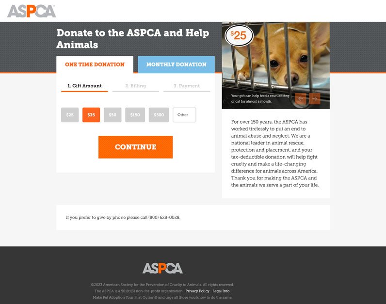
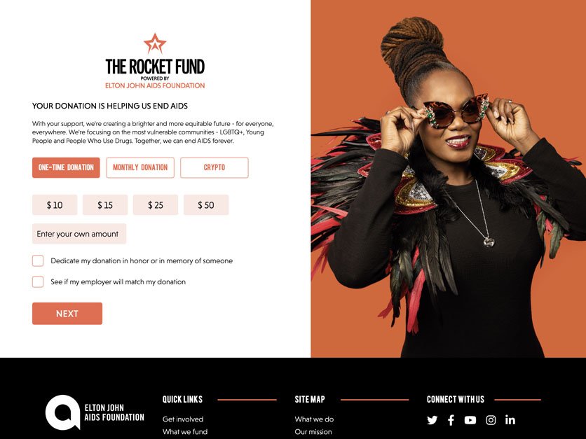
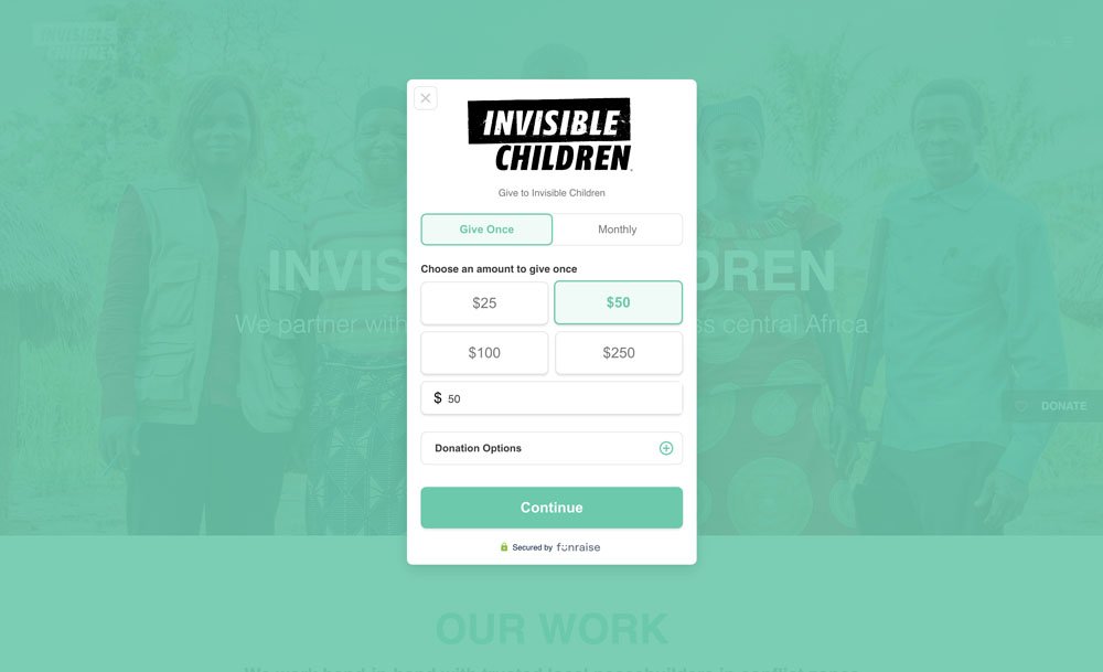
For those seeking a visual feast, we've sprinkled some eye candy. But if you're hankering for more, here's the best-looking donation experiences brought to you by some of the finest software providers.
What Makes a Great Donate Experience?
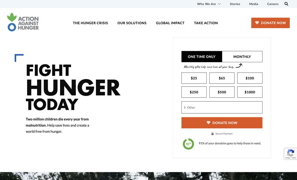
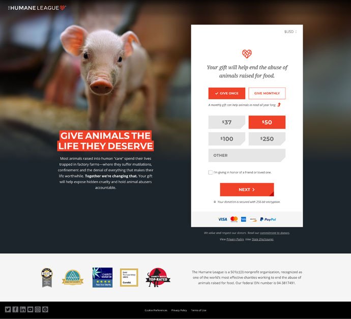
The difference between a seamless donation journey and one that feels like a labyrinth often boils down to a simple yet powerful decision – not bombarding potential donors with every conceivable field to fill. The real stars meet users with a:
- Captivating image
- Punchy title
- Message that speaks volumes
- Single straightforward decision donors have to make – "How much and how often would I like to give?"
Moreover, the champions in the donation realm are masters at shedding unnecessary layers. They strip away cumbersome terms of service, disentangle you from perplexing contribution rules, and ensure that donating doesn't feel like your users need their legal team to read the fine print before they give away a humble donation.
After all, your donors are not buying a car; they just want to do some good.
The likes of ASPCA, The Elton John AIDS Foundation, Invisible Children, Action Against Hunger, and The Humane League have truly etched their names in the pantheon of remarkable donation experiences. They've turned the act of giving into an art form, where simplicity, trust, and impact reign supreme.
Feature Animated Background
The realm of non-profit web design is embracing the surge of animated backgrounds, riding the same wave of video content that's captivating hearts across all domains.
Gone are the days of conventional rotating carousels. Marketing virtuosos are steering towards a new horizon, one adorned with the magic of meticulously curated video snippets. These snippets, woven into an endless loop, create a symphony of visual delight that keeps visitors spellbound.
This trend isn't just about aesthetics
It's a powerful tool for storytelling. It's a canvas where non-profits can paint a unified, impactful static message while simultaneously forging a potent connection with their audience.
By weaving together awe-inspiring footage from clients, supporters, or beneficiaries, non-profits craft visuals that speak the language of change. It's a visual journey that eloquently communicates the essence of being a change-maker.
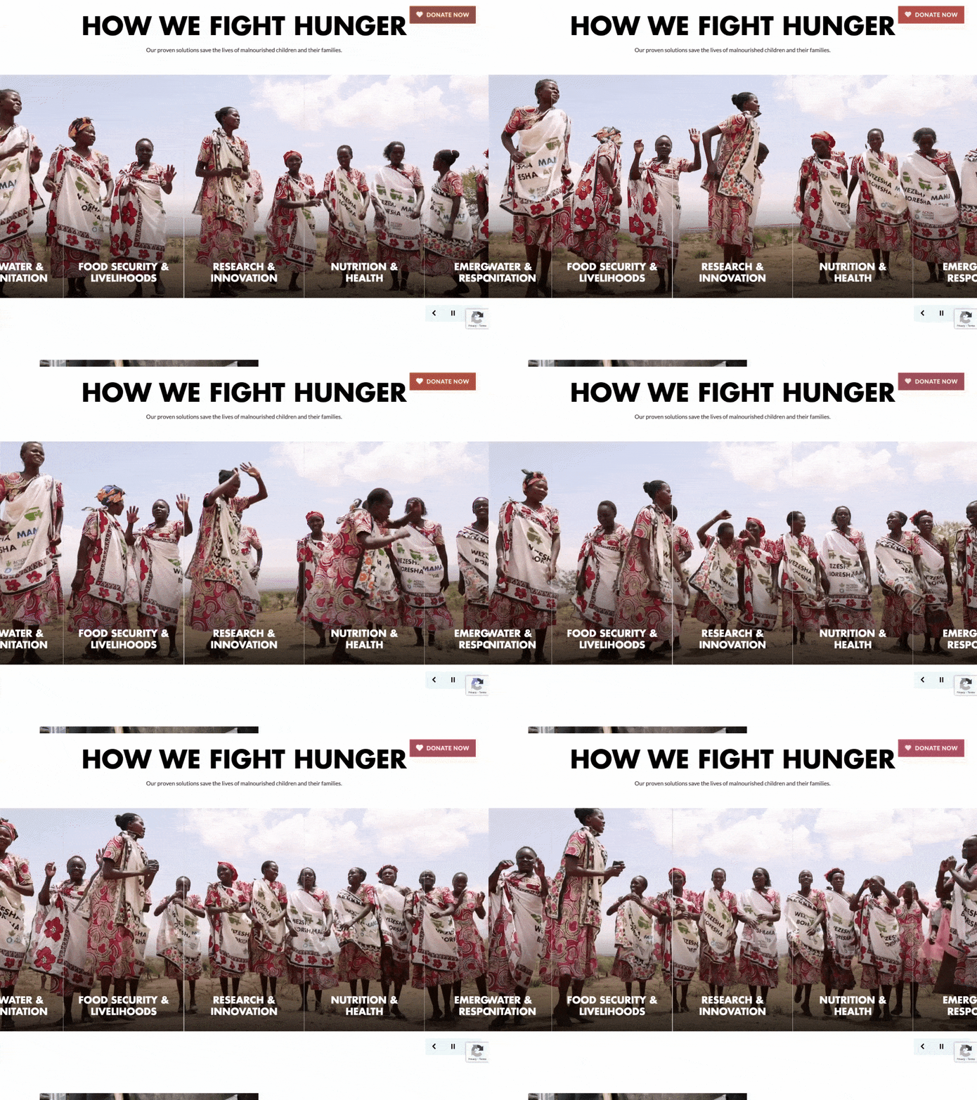
Action Against Hunger brought their issues to life by layering them on top of an animated background of the communities they serve.
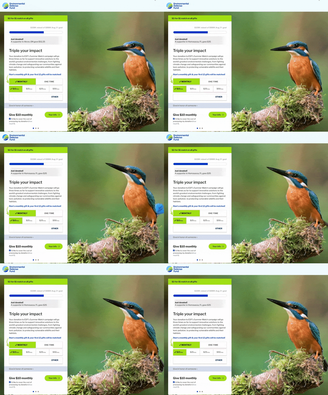
Another noteworthy example is the Environmental Defense Fund.
On their donation page, they breathe life into their cause by integrating an animated background that showcases the very essence they're committed to preserving.
Layering
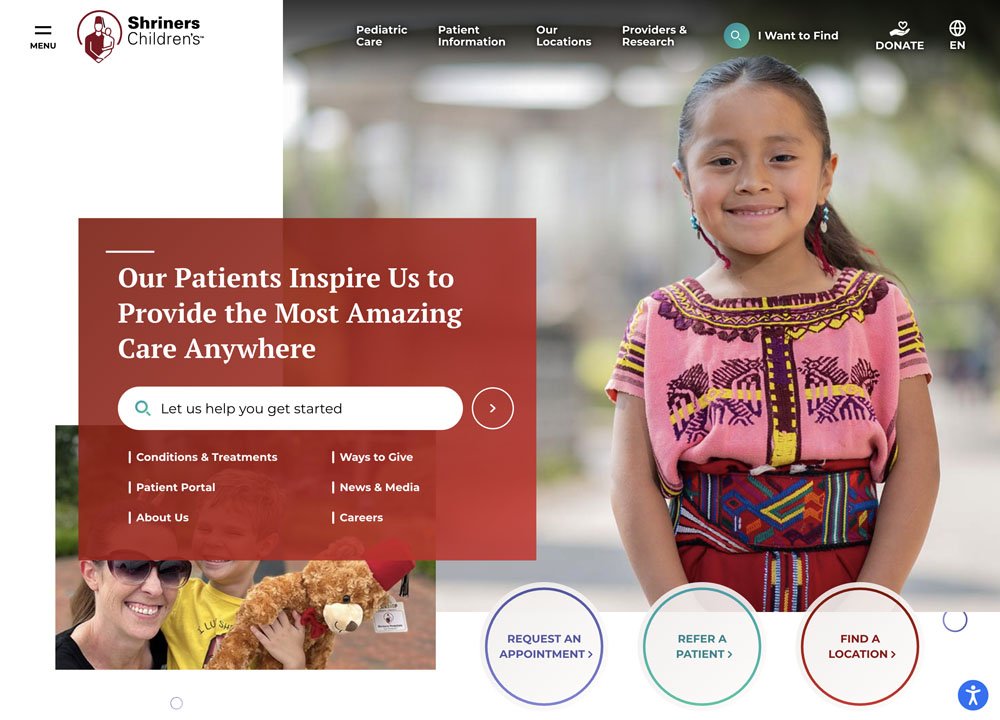
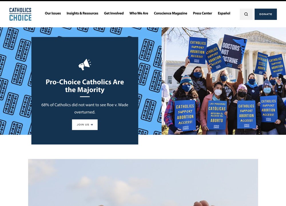
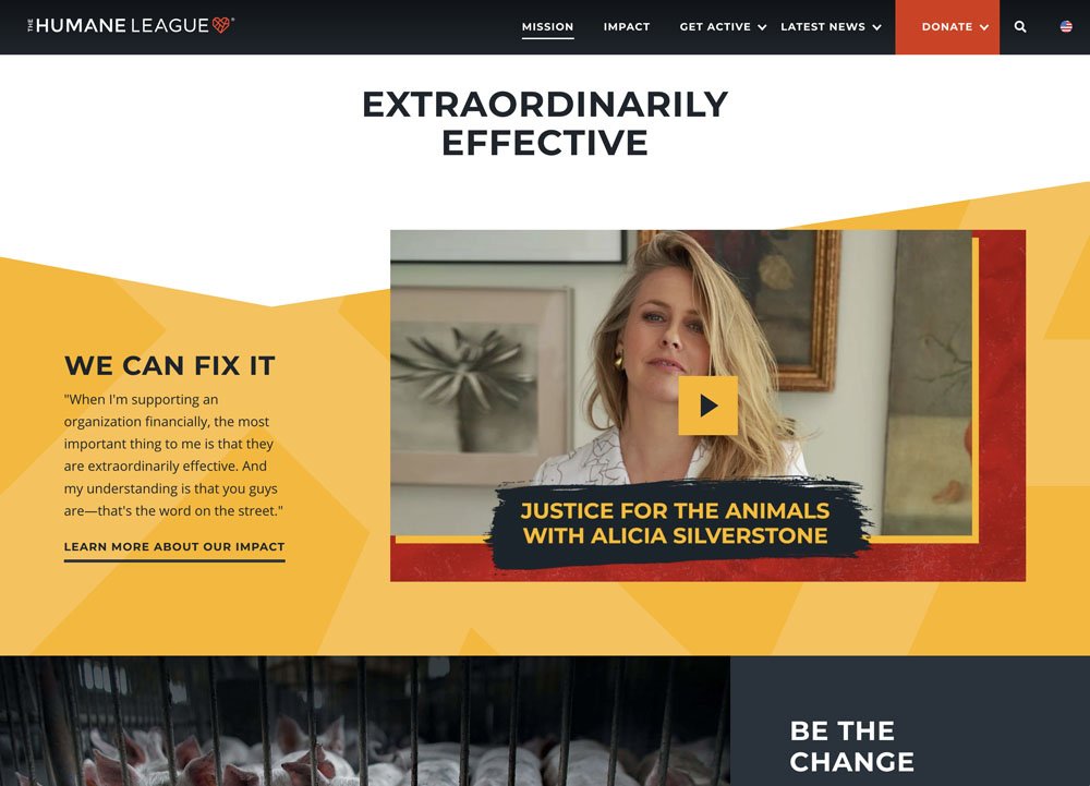
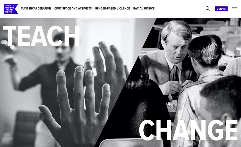
The art of layering is taking center stage, infusing vitality into content and breaking free from the predictable grids that dominate many websites. This technique involves strategically arranging elements on a webpage in layers, adding depth and dimension to the visual experience.
It carries the dual banners of functionality and narrative. It's like adding brushstrokes of depth and texture, even to the most delicate content, sculpting an engaging experience that resonates far beyond the surface
Shriners Hospital, Catholics for Choice, and The Humane League are just a few of the many groups who have embraced this trend.
Multiple Menu Styles
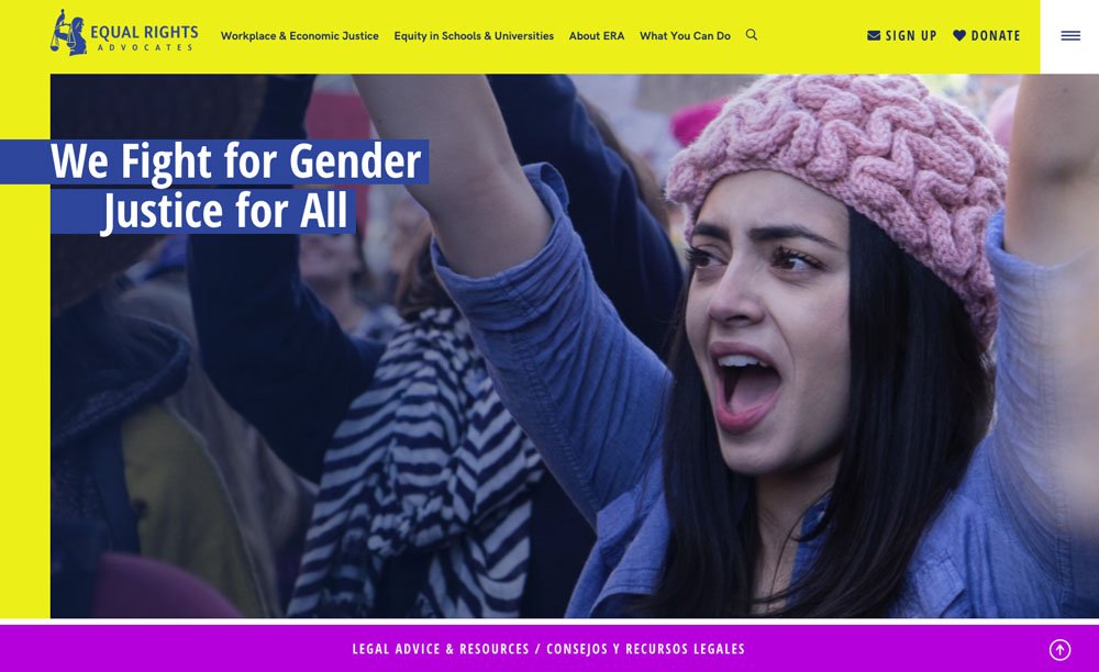
A Unique Non-Profit Trend: Combining Traditional and Mobile Menus
Non-profit websites are embracing a distinctive trend that sets them apart.
While many sites are experimenting with a mobile-only navigation style – featuring the familiar three-line menu for mobile users across all devices – non-profits are taking a different route. They are exploring a hybrid approach that can sometimes appear a bit unconventional.
This shift has caught our attention, sparking our curiosity about its motivations and implications.
Is this hybrid style A Better navigation solution?
It's certainly a possibility worth considering. However, it might also reflect a common challenge faced by non-profits – the struggle to prioritize and organize content effectively.
Instead of streamlining their existing content, they might inadvertently complicate matters by adding yet another layer of navigation.
It's an interesting trend that provokes thought about the evolving strategies in the non-profit sector, and we're eager to delve deeper into its dynamics and potential benefits.
Scrolling Effects
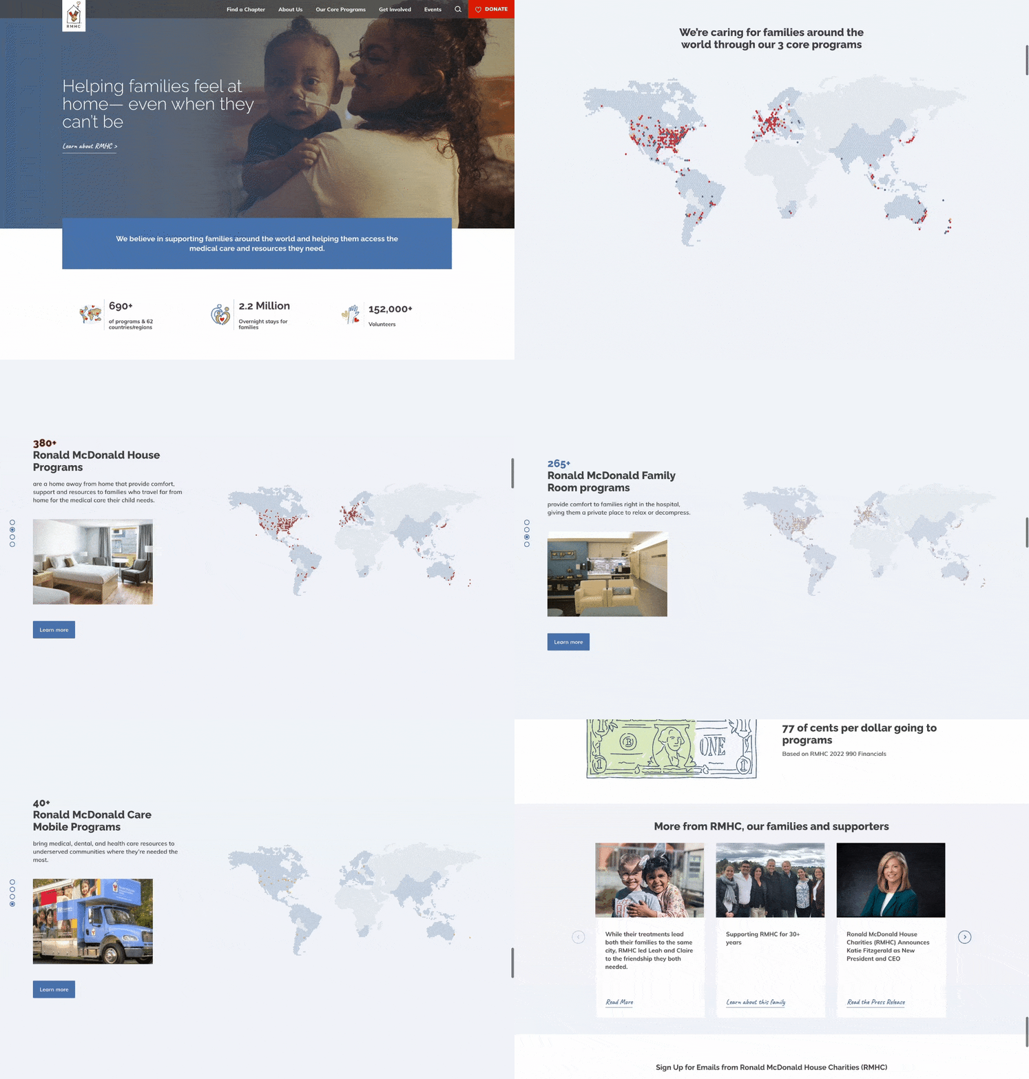
These effects introduce a touch of magic, infusing content with subtle movements that breathe life into the screen. Beyond their visual allure, scrolling effects hold the power to inspire users to journey deeper, enticing them to continue scrolling with every flick of their finger.
While the quality of the content remains crucial, scrolling effects can provide an extra layer of interest. Users might find themselves scrolling for longer periods, captivated by the subtle animations that unfold as they navigate the page.
The Ronald McDonald House website uses scrolling effects to showcase their impact and share animated maps illustrating how they support families globally. It's a practical and effective way to use scrolling effects to convey their mission.
Social Icons in Header
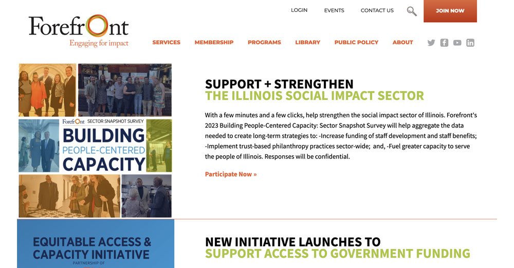
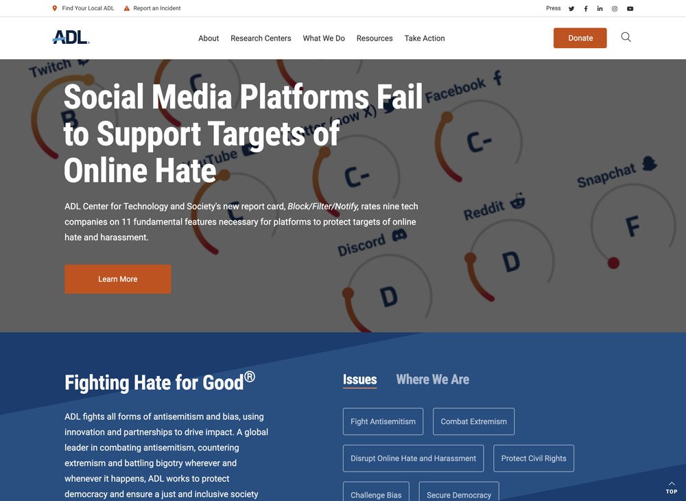
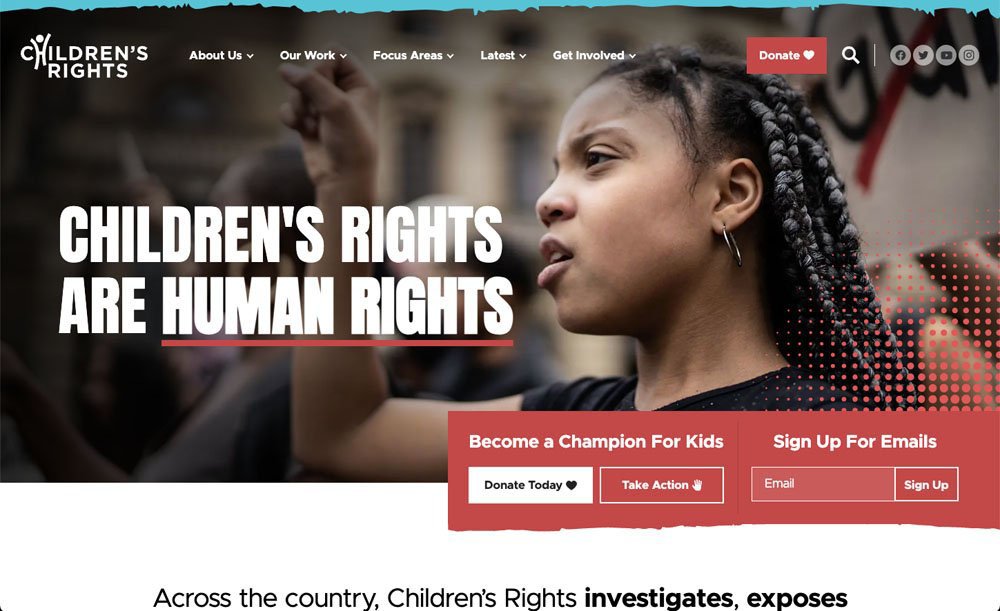
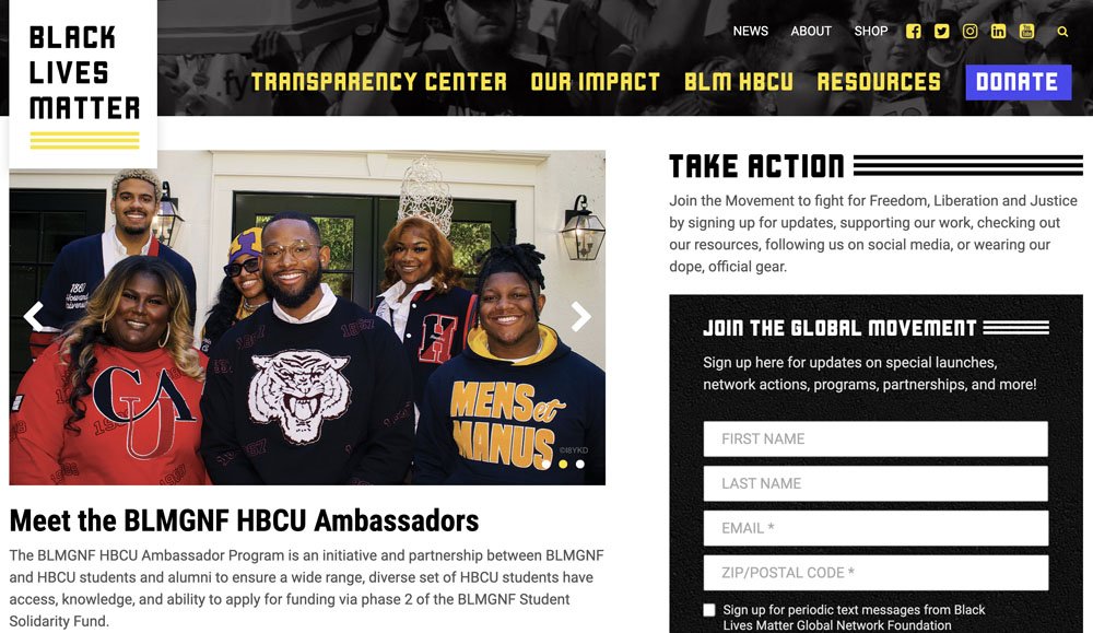
Of the 260+ sites - a startling 50 of them were doing this.
Let's Halt this Trend
It's a simple equation—investing resources into your website only to position your social links at the top, potentially whisking away your newfound visitors to another digital realm.
While we don't know who is responsible for this - for the love of all that is good and holy please stop this. If you spent anything on your website, please don't put your social links at the top of your website to send your new visitors right off to another website.
In a world already teetering on the brink of constant distractions, it seems counterintuitive to actively contribute to the chaos.
Where should social icons go?
The solution is easy. Either of the following are great options:
- Relocate them to the footer
- Reserve them for thank you pages after users have completed a key tasks
Remember, the aim is to retain your visitors, not send them off prematurely. When your site's purpose is to captivate and engage, introducing a swift exit strategy feels contradictory.
As non-profits weave together custom graphics, dynamic scrolling effects, and compelling CTAs, they're not just creating websites; they're constructing bridges of connection with their supporters, donors, and beneficiaries.
Should I Apply All of These Trends?
It's worth considering the ones that resonate with your mission, design ethos, and the ultimate enhancement of your users' experience. Each trend is an opportunity to infuse your website with a touch of innovation and resonance.
More importantly, having these trends in your back pocket arms you with a compelling toolkit. When discussions arise about optimizing donation experiences, enhancing content, or refining the overall website strategy, you're well-prepared to contribute meaningful insights.
Jump headfirst into this must-read to uncover the vibrant trends transforming the digital landscape for non-profits in 2024. From clever user engagement strategies to those that might leave you scratching your head, stay ahead with the standout trends shaping the future of non-profit web presence.


